
This post discusses a number of options that are available in Displayr for analyzing data from MaxDiff experiments. For a more detailed explanation of how to analyze MaxDiff, and what the outputs mean, you should read the post How MaxDiff analysis works.
The post will cover counts analysis first, before moving on to bringing in the experimental design and hooking it up to the more powerful technique of latent class analysis. Finally, we look at some examples of how your MaxDiff analysis can be customized and taken even further with R code.
The data set that we used for the examples in this post can be found here, and the URL that can be pasted in to obtain the experimental design is:
http://wiki.q-researchsoftware.com/images/7/78/Technology_MaxDiff_Design.csv
Download our free MaxDiff ebook
Counting analysis
To view counts of the best and worst selections, you can:
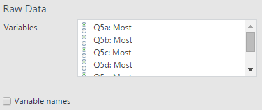
- Select Insert > More > Tables > Raw Data.

- Select the variables for the best, or most-preferred, selections in Variables. In this example, the variables are named Q5a: Most, Q5b Most, etc.
- Click Properties > GENERAL, and change the Label to: best
- Repeat steps 1 to 3, for the worst, variables, which in this example are named Q5a: Least, Q5b Least, etc.
- Click Properties > GENERAL, and change the Label to: worst
- For each of the three snippets of code below, select Insert > R Output, and paste in the code.
This code will count up the number of times each alternative was selected as best:
b = unlist(best) # Turning the 6 variables into 1 variable
t = table(b) # Creating a table
s = sort(t, decreasing = TRUE) # Sorting from highest to lowest
# Putting a name at the top of the column, and naming it.
best.score = cbind(Best = s)
This code will count up the number of selections for each of the alternatives in your MaxDiff experiment:
b = table(unlist(best))
best.and.worst = cbind(Best = b,
                       Worst = table(unlist(worst)))[order(b, decreasing = TRUE),]
To compute the difference between the best and worst counts, first create the output above for counting the best and worst, and then use this code:
diff = best.and.worst[, 1] - best.and.worst[, 2]
cbind("Best - Worst" = diff)
The experimental design
In order to analyse the MaxDiff responses with more advanced techniques (like latent class analysis, discussed below), the survey data must be combined with the experimental design. For more on how to set up the design, see How to create a MaxDiff experimental design in Displayr.
If you have created your MaxDiff design in Displayr previously, using Insert > More > Marketing > MaxDiff > Experimental design, then you don’t need to do anything special here, and you can skip to the next section. If your experimental design has been created elsewhere, then there are two ways you can bring it in to Displayr:
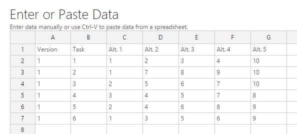
- Paste in the design from a spreadsheet. To do so, select Home > Paste Table (Data), then click the Add Data button on the right, paste your design into the Excel-like grid (as below), and click OK.
- Upload your design file to the web, and host it with a publicly-available URL.
For investigating the results from this post, it is easiest to use the URL option, and paste in the following URL:
http://wiki.q-researchsoftware.com/images/7/78/Technology_MaxDiff_Design.csv
In both cases, your design needs to have a layout like the table shown below. The first two columns denote the version number and task number for each task, and the remaining columns indicate which alternatives are shown in each task.
Latent class analysis
Displayr can analyze MaxDiff using latent class analysis. For a more detailed explanation of what this means, and how to interpret the outputs, see this post.
To set up the analysis you should:
- Import your survey data file by selecting Home > Data Set (Data) and then following the prompts.

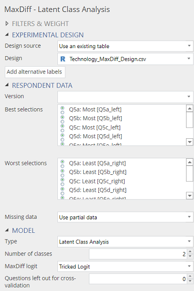
- Add the latent class analysis to your project by selecting Insert > More > Marketing > MaxDiff > Latent Class Analysis.
- Select your experimental design. Change Design location to Provide a URL and then paste in the URL found at the beginning of this post.
- In Best selections, choose the variables in your data set which identify the options that were selected as best, or most preferred, in each task. The order of the variables you have selected should match the order from the design (i.e., the variable for the first task should be selected first, the variable from the second task should be selected next, and so on).
- In Worst selections, choose the variables in your data set which identify the options that were selected as worst, or least preferred, in each task.
- Click on Add alternative labels, and enter the alternative names in the first column of the spreadsheet editor. The order of the alternatives should match the order in the design. For example, in the technology study discussed here, the first alternative in the design is Apple, the second is Google, the third is Samsung, and so on.
- Choose the Number of classes. See this post for guidance on how to do so.
Changing the Output option to Classes and recalculating the output will allow you to see the shares for each class.
Saving the classes
The classes that are identified in the latent class analysis can be used to profile other questions from your data set. To save a new variable which assigns each respondent to a class, select your latent class analysis output, and then use Insert > More > Marketing > MaxDiff > Save Variable(s) > Membership. This will create a new nominal variable that you can use in crosstabs with other questions.
Note that in latent class analysis, each respondent has a probability of being assigned to each class, but when class membership is saved using this option, each respondent is assigned to the class with the highest probability. As a result, there will be some difference between the class sizes reported in the latent class analysis output and the number of respondents that are ultimately assigned to each class. To view the class membership probabilities, use Insert > More > Marketing > MaxDiff > Save Variables > Class Membership Probabilities.
Respondent-level preference shares
To create variables which contain estimated preference shares for each respondent, based on the latent class analysis, select Insert > More > Marketing > MaxDiff > Save Variable(s) > Compute Preference Shares. When shown in a SUMMARY table, the output will show an average of the preference share for each alternative. To see the shares assigned to each respondent, change the selection in the Home > Columns menu to RAW DATA.
Charting preference shares
Any table showing preference shares can be used to create a visualization. One nice example is the donut plot shown below. With a little code, you can also extract the Total column from the latent class analysis (or any of the columns, for that matter), so that you can get them in to your plot.
Having set up the latent class analysis you can:
- Select Insert > R Output.
- Paste the code below into the R CODE section.
- Click on your latent class output, select Properties > GENERAL, and copy the Name if it is different to latent.class.analysis.
- Go back to your new output, and paste in the name in place of latent.class.analysis.
- Change the number at the end of the first line to refer to the number of the column you want to plot.
- Click Calculate.
The code for extracting the column of preference shares is:
pref.shares = latent.class.analysis$class.preference.shares[, 6]
pref.shares = sort(pref.shares, decreasing = TRUE) * 100
Here, latent.class.analysis$class.preference.shares[, 6] simply refers to the 6th column in the latent class analysis output table. For the output with 5 classes, this simply refers to the Total column. If you want to chart the shares for a particular class, you could simply change 6 for the number of the class you want to chart.
To make the donut chart:
- Select Insert > Visualization > Donut Chart.
- Choose the pref.shares table in the Table menu.
- Click Calculate.
Preference simulation
Here, preference simulation refers to the process of removing some alternatives from the calculated shares, and then rebasing the remaining shares to see how they adjust in the absence of the removed alternatives. While the calculation is slightly more complicated than the ones that we have looked at so far in this post, it is still really straight-forward
- Examine your latent class output and work out the row numbers for the alternatives.
- Select Insert > R Output, and paste the snippet of code below into the R CODE section.
- Modify the first line of your output if it is not called latent.class.analysis (remember, to find the correct name to use, select your latent class analysis and look at Properties > GENERAL > Name).
- Modify line 5 to remove the rows that you want to exclude. In the example snippet, the brands of interest were in lines 1 and 6. The minus sign indicates that the rows should be excluded from the new table of shares. For example, if in your analysis you want to remove rows 2, 3, and 9, you would change x[ c(-1, -6), ] to x[ c(-2, -3, -9), ] in the code.
input.analysis = latent.class.analysis
# Remove the total column
x = input.analysis$class.preference.shares[, -6] * 100
# Removing Apple and Samsung
x = x[c(-1, -6),]
# Re-basing
x = prop.table(x, 2)* 100
# Adding the total
sizes = input.analysis$class.sizes
x = cbind(x, Total = rowSums(sweep(x, 2, sizes, "*")))
new.preferences = rbind(x, Total = colSums(x))
Summary
Displayr includes a powerful latent class analysis tool that can be used to analyze data from a MaxDiff experiment by combining the survey responses with the information from the experimental design. By adding a little R code, you can customize your analysis even further.