
Download our free MaxDiff eBook!
Counting the best scores (super-simple, super risky)
The simplest way to analyze MaxDiff data is to count up how many people selected each alternative as being most preferred. The table below shows the scores. Apple is best. Google is second best.
This ignores our data on which alternative is worst. We should at least look at that. It shows us something interesting. While Apple is clearly the most popular, it has its fair share of detractors. So, just focusing on its best scores does not tell the true story.
The next table shows the differences. It now shows that Apple and Google are almost tied in preference. But, we know from just looking at the best scores, that this is not correct!
What is going on here? First, Apple is the most popular brand. This last table is just misleading. Second, and less obviously, the reason that the last table tells us a different story is that Apple is a divisive brand. It has lots of adherents and a fair number of detractors. This means that we need to be focused on measuring preferences at the respondent level, and grouping similar respondents (i.e., segmentation). As we will soon see, there is a third problem lurking in this simplistic analysis, and we will only find it by turning up the heat on our stats.
Looking at best and worst scores by respondent
The table below shows the MaxDiff experimental design used when collecting the data. The choices of the first respondent in the data set are shown by color. Blue shows which alternative was chosen as best. Red for worst. The question that we are trying to answer is, what is the respondent’s rank ordering of preference between the 10 tech brands?
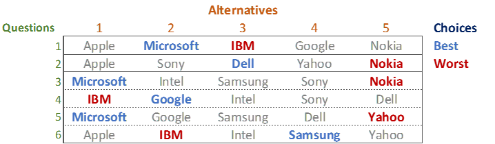
The simplest solution is to count up the number of times each option is chosen, giving a score of 1 for each time it is chosen as best and -1 for each time it is chosen as worst. This leads to the following scores, and rank ordering, of the brands:
Microsoft 3 > Google 1 = Samung 1 = Dell 1 > Apple = Intel = Sony > Yahoo -1 > Nokia -2 > IBM -3
This approach is very simple, and far from scientific. Look at Yahoo. Yes, it was chosen as worst once, and our counting analysis suggests it is the third worst brand, less appealing to the respondent than each of Apple, Intel, and Sony. However, look more carefully at Question 5. Yahoo has been compared with Microsoft, Google, Samsung and Dell. These are the brands that the respondent chose as most preferred in the experiment, and thus the data suggests that they are all better than Apple, Intel, and Sony. That is, there is no evidence that Yahoo is actually worse than Apple, Intel, and Sony. The counting analysis is simple but wrong.
A more rigorous analysis
We make the analysis more rigorous by taking into account which alternative was compared with which others. This makes a difference because not all combinations of alternatives can be tested, as it would lead to enormous fatigue. We have already concluded that Yahoo is no different from Apple, Intel, and Sony, which leads to:
Microsoft > Google = Samsung = Dell > Apple = Intel = Sony = Yahoo > Nokia > IBM
Which brand is the second most preferred? Each of Samsung, Google, and Dell have been chosen as best once. Does this mean they are all in equal second? No, it does not. In Question 4, Dell was against Google, and Google was preferred. Thus, we know that:
Microsoft > Google > Dell > Apple = Intel = Sony = Yahoo > Nokia > IBM
But, note that I have removed Samsung. Samsung is a problem. It may be between Microsoft and Google. It may be between Google and Dell. Or, it may be less than Dell. There is no way we can tell! We can guess that it has the same appeal as Dell. I have drawn Samsung in blue, as while the guess is not silly, it is, nevertheless, a not-super-educated guess:
Microsoft > Google > Samsung = Dell > Apple, Intel, Sony, Yahoo > Nokia > IBM
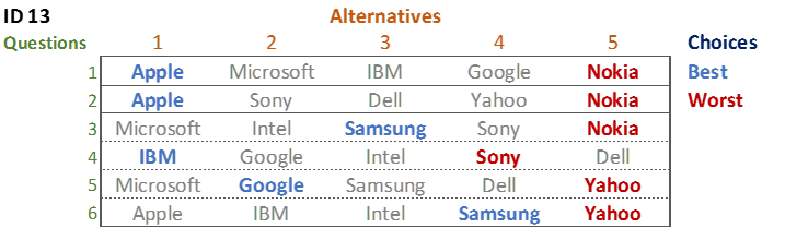
A more difficult problem is posed by respondent 13’s data. She chose Apple twice as best, Samsung twice, and Google and IBM once each. Which is her favorite? Here it gets really ugly. The data shows that:
- Apple > Google in 1 place (Question 1)
- Apple > IBM (Question 1)
- IBM > Google (Question 4)
- Google > Samsung (Question 5)
- Samsung > Apple (Question 6)
- Samsung > IBM (Question 6)
This data is contradictory. Look at the first three points. They tell us that Apple > IBM = Google. But, the last 3 tell us that Google > Samsung > Apple = IBM.
Most people’s instinct when confronted by data like this is to say that the data is bad and to chuck it away. Unfortunately, it is not so simple. It turns out most of us give inconsistent data in surveys. We get distracted and bored, taking less care than we should. We change our minds as we think. The interesting thing about MaxDiff is not that it leads to inconsistent data. Rather, it is that it allows us to see that the data is contradictory. This is actually a good thing as, if we had instead, for example, asked the respondent to rank the data, it would still have contained errors, but we would never have seen them as we would have no opportunity to see the inconsistencies.
To summarize:
- Computing scores for each respondent by summing up the best scores and subtracting the worst scores is not valid.
- We do not have enough data to get a complete ordering of the alternatives.
- Respondents provide inconsistent data.
Fortunately, a bit of statistical wizardry can help us with these problems.
The magic – latent class analysis
The problem of respondents providing inconsistent data is not new. It has been an active area of academic research since the 1930s. The area of research that deals with this is known as random utility models, and if you are reading this post you may already be familiar with this class of models (e.g., multinomial logit, latent class logit, random parameters logit, are all models that solve this problem).
The second part of the problem, which is that we have incomplete data, is solved by borrowing data from other respondents. Surprisingly to me, even when there is sufficient data to compute preferences for each respondent separately, it is usually still better to estimate preference by combining their data with that of similar respondents. I think that this is because when we analyze data of each respondent in isolation, we over-fit, failing to spot that what seemed like preferences were really noise.
These two problems are jointly solved using latent class analysis. The special variant that I illustrate below is latent class rank-ordered logit with ties. It is an exotic model, specially developed for latent class analysis. There are other latent class models that can be used. I am not going to explain the maths. Instead, I will just explain how to read the outputs.
Latent class analysis is like cluster analysis. You put in a whole lot of data, and tell it how many classes (i.e., clusters) you want. The table below shows the results for five classes (i.e., segments). The results for each class are shown in the columns. The size of the class is shown at the top. Beneath is the Probability %, also known as a preference share (i.e., the estimated probability that an person in the segment will prefer an alternative from all the alternatives in the study).
Learn more about MaxDiff with this comprehensive guide
Class 1 consists of people that have, on average, the preference ordering of Samsung > Google > Microsoft > Sony > … . It is 21.4% of the sample. Class 2 consists of people with a strong preference for Apple. Class 3 consists of people that like both Apple and Samsung. People that prefer Sony and Nokia appear in Class 4, but have no super-strong preferences for any brand. Class 5 is also preferring Apple, then Microsoft.
If you look at the Total column you will see something that may surprise you. Google’s share is only 12.8%. It is less than Samsung. This contradicts the conclusions from the earlier counting analyses which showed Google as the second most popular brand based on the number of times it was chosen as best, and neck-and-neck with Apple once the worst scores were factored in. How is it that the latent class analysis gives us such a different conclusion? The reason is that the earlier counting analysis is fundamentally flawed.
Looking again at the latent class results, we can see that Google has a moderate share in all of the segments. In this experiment, each person completed six questions. The number of times they chose each of the brands as best across those questions is shown below. The way the experimental design was created is that each alternative was shown only three times. If you look at the 3 times column in the table below, it shows that 36% of people choose Apple best 3 times, 20% chose Samsung 3 times, and 12% chose Google best 3 times. So, we can conclude that Apple is around 3 times as likely to be most preferred compared to Google. Now look at the Once and Twice columns. Google is the most likely brand to be chosen once. And, it is also the most likely brand to be chosen twice. So, Google is the most popular fallback brand. This highlights why the crude counting analyses can be so misleading. People are asked to make 6 choices, but the experimental design only shows them their most preferred brand 3 times, and the counting analysis thus over-inflates the performance of second and third-preferred brands.
Create your own MaxDiff Latent Class Analysis!
In the five-class solution above, only Apple clearly dominates any segment. This is not an insight. Rather, it is a consequence of the number of classes that were selected. If we select more classes, we will get more segments containing sharper differences in preference. The table below shows 10 classes. We could easily add more. How many more? There are a few things to trade-off:
- How well our model fits the data. One measure of this is the BIC, which is shown at the bottom of the latent class tables. All else being equal, the lower the BIC the better the model. On this criterion, the 10-class model is superior. However, all else is rarely equal, so treat the BIC as just a rough guide that is only sometimes useful.
- The stability of the total column. If you compare the 10 and 5 class solution, you can see that they are highly correlated. However, it is the 10 class solution that is the most accurate estimate (for the more technical readers: as the model is non-linear, the total column, which is a weighted sum of the other columns, is invalid when the number of classes is misspecified).
- Whether the brands of interest to the stakeholder get a high preference score in any of the segments. For example, in the table below, there is lots of interest in Apple, Samsung, Sony, and Google, but if you were doing the study for another of the brands, you would probably want to increase the number of classes to find a segment that will resonate with the client. Provided that the BIC keeps decreasing, there is nothing dodgy about this.
- The complexity of the solution for stakeholders. The fewer classes, the more intelligible.
The donut chart below displays the preference shares for the 10-class solution (i.e., its Total column).
Create your own Pie or Donut Chart!
Profiling latent classes
Once we have created our latent classes, we allocate each person to a class and then profile the classes by creating tables. The table below, for example, shows our 5-class solution by product ownership. If you compare this table with the latent class solution itself, you will see that the product ownership lines up with the preferences exhibited in the MaxDiff questions.
Respondent-level preference shares
Sometimes it is nice to have preference shares for each respondent in the survey. Typically, they are used as inputs into further analyses (e.g., segmentation studies using multiple data sources). Once you have estimated a latent class model these are easy to compute (they are a standard output). However, they are not super-accurate. As we discussed above, there is insufficient information to compute a person’s actual preference ordering, so inevitably any calculations of their preference shares relies heavily on the data shared from other respondents, which in turn is influenced by how good the latent class model is at explaining the data. The table below shows the respondent-level preference shares from the 5-class model.
The table below shows the average of the probability percentages computed to for each respondent. They are very similar to the results in the total column of the latent class model, but not quite the same (again, if you are super-technical: this is due to the non-linearity in the computations; a big difference between these would be a clue that the model is poor). The Total column is more accurate than the Mean Probability % column shown on this table.
I have plotted the histograms of the preference distributions for each of the brands below. These distributions are based on our 5-class model. Thus, they are unable to show any more variation in the preferences than were revealed in the earlier analysis. If we used more classes, we would get more variation. However, there are better ways to achieve this outcome.
The table below shows the preference share distributions from an even more complex model, known as a boosted varying coefficients model. (You won’t find this in the academic literature; we invented it, but the code is open-source if you want to dig in.) This shows better distributions for each of the brands (wider = better). A more technical blog post that discusses these more complex models can be found here.
The table below shows the preference shares for each respondent from this model. Take a look at respondents 1 and 13, who we examined at the beginning of the post. The first respondent’s clear preference for Microsoft and Google, and dislike for IBM, Nokia, and Yahoo shows through, even though some of the ordering has shifted slightly. Respondent 13’s contradictory selections have been resolved in favor of Apple, which they selected twice as their most-preferred.
From these respondent-level shares, the Mean Probability % works out as shown in the table below, which again matches the latent class analysis output quite closely.
Preference simulation
Sometimes in marketing applications of MaxDiff, people choose between alternative products. When doing such studies, it can be interesting to understand the preference shares after having removed some of the alternatives. This is super-simple. All we have to do is to delete the columns of the alternatives that we wish to exclude, and then re-base the numbers so that they add up to 100%. Below, I have recomputed the preference shares with Samsung and Apple removed.
Create your own MaxDiff Design!
Summary
Simple analysis methods are invalid for MaxDiff. They lead to grossly misleading conclusions. The application of more advanced techniques, such as latent class analysis, will, on the other hand, give significantly more meaningful results.
If you click here, you can login to Displayr and see all the analyses that were used in this post. Click here for a post on how to do this yourself in Displayr, and here for one on how to do it in Q.