Customer satisfaction is an especially useful metric when tracked over time. By regularly sending out customer feedback surveys, you can measure how satisfaction rates are trending. Here are a few data models and visualizations to help you analyze your customer satisfaction time series data.
Tutorial: Measure Customer Satisfaction in Displayr
Average satisfaction over time
Creating a crosstab of the Date with Overall Satisfaction automatically shows the average satisfaction per time period. We can also include the row sample size in the table. For our example, we chose an aggregation period of a month, but if your row sample size is small you can use a larger aggregation period.
Significant values are indicated by blue or red arrows. In this table, the only significant value is a higher satisfaction in the last month. However, the row sample size is also much smaller than the other months. This suggests that the data collected over May is incomplete (or at least, not comparable to the other months). We will omit this time point from analysis using monthly aggregated data.
Trends in average satisfaction over time
To look for patterns in change over time we use the table to create a chart. We added a trend line, which can make patterns more visible. We excluded the last data point from the trend to avoid using incomplete data. From the column chart, it is clear that there is no strong trend. In fact if you hover over the trend line you can see that average satisfaction is actually decreasing slightly.
Learn how to analyze customer satisfaction trends in Displayr
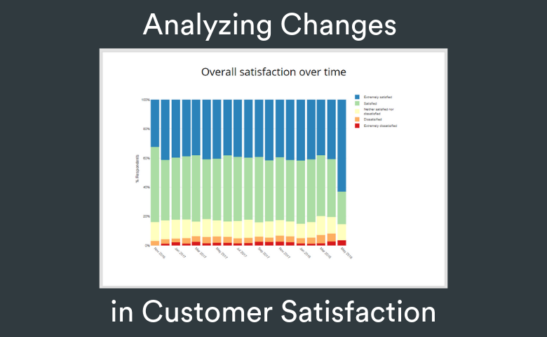
Changes in the distribution over time
To look at not only the averages but the entire distribution of responses, we use a stacked column chart showing cumulative percentages. The upper edge of the orange bar shows the percentage of respondents who gave a score of 1 (extremely dissatisfied) or 2 (dissatisfied). From the stacked chart, we can see that the proportion of dissatisfied or extremely dissatisfied respondents has increased from January 2018 to April 2018.
To confirm these results are significant, we can perform a linear regression using only data from January 2018.
The pink highlighting in the table above shows that the coefficient for Date is significantly different from zero. In fact, the results suggest that overall satisfaction is decreasing on average by 0.04 per month. In contrast, when we perform the same analysis for the whole data set (below), we see no significant trend.