Correspondence analysis is one of those rare data science tools which make things simpler. You start with a big table that is too hard to read, and end with a relatively simple visualization. In this post I explain how you can work out if a table is suitable for correspondence analysis.
Correspondence analysis is useful when you have a table with at least two rows and two columns, no missing data, no negative values, and all the data has the same scale. The only hard bit of this to understand is “same scale”, which is the focus of the examples here.
Contingency tables (OK)
The classic application for correspondence analysis is the analysis of contingency tables. A contingency table is a crosstab where the row categories are mutually exclusive and the column categories are also mutually exclusive. When your data looks like this, correspondence analysis is usually going to do the job.
In the example below I almost show a contingency table. I say almost, because I have included the row and column totals (labeled as NET). If I were to run correspondence analysis on this table, it would not be valid, because the totals are on a different scale from the rest of the data.
There is a simple way to understand this problem. Does the table cease to make sense if it is sorted by any of its rows or columns? Consider the Coca-Cola row. Sorting by this row would move the NET to the beginning of this row, would it add insight? No. It would not. It would probably just create confusion. Fortunately, most data science apps are smart enough to leave the row and column totals out of correspondence analysis, so I will not talk about this trivial case again. Once the totals are removed, this table is perfect for correspondence analysis.
We could also conduct a correspondence analysis if we instead showed row percentages, column percentages, or index values. However, each will give a different output, as each analysis emphasizes different aspects of the data, and these aspects are emphasized by the resulting correspondence analyses.
Square tables (OK)
The table below shows a special type of table where the rows and columns have the same labels. This table is showing car choices, where the rows represent the cars previously owned, and the columns represent the cars currently owned by a sample of buyers. Such tables have various names, such as switching matrices, transition tables, and confusion matrices. They can all be analyzed using correspondence analysis, but there is a (small) benefit in using a special variant of correspondence analysis designed for such square tables.
The plot below has been created using the special variant of correspondence analysis designed for square tables. The chief practical benefit of this method is that we don’t plot both the column and the row labels, and can thus interpret relationships by looking at how closely together the labels appear. In this example, Porche is dominating the analysis. Looking at the raw data, we can see that it has a small sample size. We have three options:
- We can simply remove it from the plot (you can do this by dragging and dropping). If you do this, it does not re-estimate the map. Rather, it still includes Porche in the analysis, so this is probably not the ideal solution.
- Merge similar brands and re-run the analysis.
- Re-run the analysis with the brand removed. This is generally my preferred option.
Tables with multiple statistics (bad)
The table below shows both counts and column percentages. The data here is clearly on two different scales, making correspondence analysis inappropriate. We could scale the counts by turning them into percentages, but then we would just have the same data twice, which would be pointless.
Multiple tables spliced together (bad, unless scaled)
The table below, which shows cola preference by age and gender, would not be great for correspondence analysis. Why? The problem is that the data is not all on the same scale. There is an easy way to see this. If the data is all the same scale, it means that it is meaningful to sort the table by any of its rows and columns. If we were to sort this table by the first row, we would get Male and Female appearing first, because they have larger base sizes, and not because the sorting would be meaningful.
This gives us some insight into how to fix the problem. We need to transform the data in some way so that it is all on the same scale. We can achieve this by dividing each number by the column total (the NET at the bottom of the table), which gives us the table below. With this table, it makes sense to sort by the first row (which reveals that Coca-Cola preferences differ much more widely by age than by gender). It would also be appropriate to sort the table by any of the columns.
The next example has also been constructed using two tables. The last column shows the average attitude score for each brand, collected on a 5-point scale. Hopefully it is easy to see that the data in this table is not on the same scale, making it inappropriate for correspondence analysis.
The next table shows the same data again, but “fixed”, so that it adds up to 100. Is this table OK? No. The best way to appreciate the problem is to focus on Diet Pepsi. Diet Pepsi has the lowest score of any of the brands on Attitude. However, if we read across the Diet Pepsi row, we see that Diet Pepsi ends up getting its “best” score for Attitude. If you were to apply correspondence analysis, it would tell you that Pepsi “owns” Attitude.
Multiple response tables and grids (OK)
Most tables that show multiple response data can also be used with correspondence analysis. The table below, which is referred to as a brand association grid by market researchers, is made up of the data from 63 different variables. Each of the 800 respondents in the data set has indicated which brands possess which attitudes. As the data is non-negative, and is all on the same scale, it is a prime candidate for correspondence analysis.
Tables of means (OK)
The table below shows averages. It meets all the requirements for correspondence analysis. (Although, as there are only two rows of data, the resulting map will show all the data points organized along a straight line, which can cause a bit of a panic for you if you are not expecting it.)
Correlations (usually bad)
The next table shows correlations between two sets of variables. Correspondence analysis will not work here as we have negative values.
The next table is the same as the previous one, except that I have added 1 to every number. This means that there are no longer negative results. This data now meets the requirements for correspondence analysis. Sure, there are perhaps better techniques, such as canonical correlation analysis, but we can extract insights from this table using correspondence analysis.
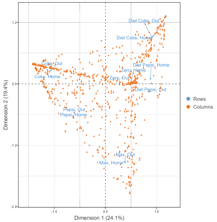
Raw data (usually OK)
The table below shows the raw that we used to compute correlations above. Each row represents a person. Each column indicates the consumption of the different brands either at home or out and about. Is it OK? Raw data is usually OK, provided that the data is either binary or numeric. And, raw data for unordered categorical variables (e.g., occupation, brand preference), will not work, as the data has no meaningful scaling (i.e., averages do not make sense). In this specific case, we have a few rows with no data, and that causes a problem. But, once they are removed, we can get a useful map, as shown below.
The cool thing about using raw data is we can understand the distribution of respondents in the data. The hard thing though is that all the usual rules of interpretation apply, so these plots can be quite difficult to interpret correctly.
Create your own Correspondence Analysis
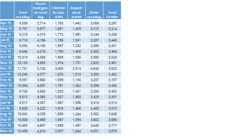
Time series data (e.g., sales data)
The final example, shown below, shows sales by different retailer categories by month. While you may not think of sales data as being appropriate for correspondence analysis, it satisfies all the criteria.
The visualization below is from of the sales data. It shows department store and clothes/accessory sales are strongly associated with December.
Limitations of correspondence analysis
Correspondence analysis is a powerful tool for simplifying tables. Provided that your data is appropriate – two or more dimensions, no negatives, consistently scaled – it can do the job.
However, even when your data is in order, there are limitations.
It emphasizes the biggest differences in the data, which means smaller patterns can be overlooked. If your table has sparse or unbalanced data—like a category with very low counts—it can skew the results and distort the map.
There’s also a risk of over-interpreting the distances on the plot. Just because two points are close doesn’t always mean they’re meaningfully related.
Finally, it’s not ideal for ordinal or continuous data unless you’ve carefully transformed it. In those cases, other methods like factor analysis might work better.
If you have the data, but are unsure where to start, you can create your own correspondence analysis with our free tutorial.