

What is a ROC curve?
A Receiver Operator Characteristic (ROC) curve is a graphical plot used to show the diagnostic ability of binary classifiers. It was first used in signal detection theory but is now used in many other areas such as medicine, radiology, natural hazards and machine learning. In this post I’ll show you how a ROC curve is created and how to interpret the ROC curve.
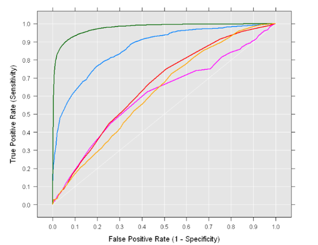
An example is shown below:
Creating a ROC curve
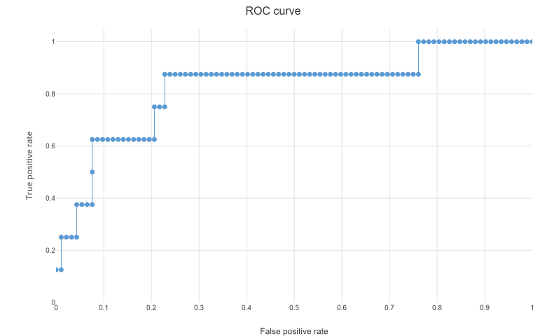
A ROC curve is constructed by plotting the true positive rate (TPR) against the false positive rate (FPR). The true positive rate is the proportion of observations that were correctly predicted to be positive out of all positive observations (TP/(TP + FN)). Similarly, the false positive rate is the proportion of observations that are incorrectly predicted to be positive out of all negative observations (FP/(TN + FP)). For example, in medical testing, the true positive rate is the rate in which people are correctly identified to test positive for the disease in question.
A discrete classifier that returns only the predicted class gives a single point on the ROC space. But for probabilistic classifiers, which give a probability or score that reflects the degree to which an instance belongs to one class rather than another, we can create a curve by varying the threshold for the score. Note that many discrete classifiers can be converted to a scoring classifier by ‘looking inside’ their instance statistics. For example, a decision tree determines the class of a leaf node from the proportion of instances at the node.
How to interpret a ROC curve
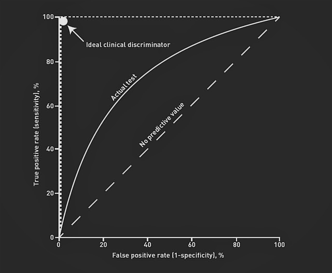
The ROC curve shows the trade-off between sensitivity (or TPR) and specificity (1 – FPR). Classifiers that give curves closer to the top-left corner indicate a better performance. As a baseline, a random classifier is expected to give points lying along the diagonal (FPR = TPR). The closer the curve comes to the 45-degree diagonal of the ROC space, the less accurate the test.
Note that the ROC does not depend on the class distribution. This makes it useful for evaluating classifiers predicting rare events such as diseases or disasters. In contrast, evaluating performance using accuracy (TP +
TN)/(TP + TN + FN + FP) would favor classifiers that always predict a negative outcome for rare events.
ROC curve interpretation: How-to guide
To simplify interpreting an ROC curve, consider the following step-by-step guide:
- Locate the Curve – A curve closer to the top-left corner indicates a more accurate classifier.
- Compare to Diagonal – The diagonal line (FPR = TPR) represents random guessing; curves near it have poor predictive power.
- Check the Trade-off – Moving along the curve shows how sensitivity (true positive rate) changes against specificity (1 – false positive rate).
- Consider Class Imbalance – ROC curves work well even when your dataset has rare events, unlike accuracy, which can be misleading in these cases.
Area under curve (AUC)
To compare different classifiers, it can be useful to summarize the performance of each classifier into a single measure. One common approach is to calculate the area under the ROC curve, which is abbreviated to AUC. It is equivalent to the probability that a randomly chosen positive instance is ranked higher than a randomly chosen negative instance, i.e. it is equivalent to the two sample Wilcoxon rank-sum statistic.
A classifier with high AUC can occassionally score worse in a specific region than another classifier with lower AUC. But in practice, the AUC performs well as a general measure of predictive accuracy
How to choose the optimal threshold using the ROC curve
Selecting the optimal threshold is a key step in turning ROC curve analysis into real-world decisions. Each point on the ROC curve represents a different threshold for classifying a prediction as positive. A lower threshold increases sensitivity (true positive rate) but may also raise the false positive rate, while a higher threshold does the opposite.
To find the best threshold, consider what matters most for your application. One common approach is to maximize Youden’s J statistic (Sensitivity + Specificity – 1), which identifies the point on the ROC curve farthest from the diagonal line of random guessing. Alternatively, you might choose a threshold that balances sensitivity and specificity, or one that prioritizes minimizing false positives or false negatives, depending on your needs.
For example, in medical testing, you may want to select a threshold that minimizes missed diagnoses (false negatives), even if it means more false positives. Visualizing the ROC curve and calculating these metrics at different thresholds can help you make an informed, data-driven choice tailored to your specific context.
FAQs About ROC Curves
What does a ROC curve show?
A ROC (Receiver Operating Characteristic) curve shows the trade-off between a classifier’s sensitivity (true positive rate) and specificity (1 – false positive rate) across different decision thresholds. It visualizes how well a model can distinguish between two classes, with curves closer to the top-left corner indicating better performance.
How do you interpret the AUC?
The AUC (Area Under the ROC Curve) summarises the model’s overall ability to discriminate between positive and negative classes:
- 0.5 = No discrimination (random guessing)
- 0.7–0.8 = Acceptable
- 0.8–0.9 = Excellent
- >0.9 = Outstanding
Higher AUC values mean the classifier is more effective.
How do you create a ROC curve in Excel?
To create a ROC curve in Excel:
- Prepare your data with actual outcomes (0 or 1) and predicted probabilities.
- Calculate the True Positive Rate (TPR) and False Positive Rate (FPR) for different thresholds.
- Plot FPR on the X-axis and TPR on the Y-axis using a Scatter or Line chart.
- Add a diagonal reference line to show the “random guess” baseline.
What is the best ROC curve?
The best ROC curve would hug the top-left corner of the graph, indicating high sensitivity with very few false positives, and have an AUC close to 1.0. This means the classifier correctly identifies almost all positives while rarely misclassifying negatives.
Create your own ROC curve in Displayr. Sign up here and get started.