

A Violin plot can be created by selecting Insert > Visualizations > Violin plot. Similar to other types of visualizations, there are three possible ways to supply your data.
1. Pasting data
This is the easiest way to test out a Violin plot. Click on the Paste or type data button and a spreadsheet will pop up and allow you to paste your data.
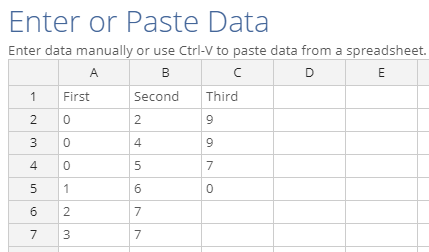
In this simple example, we want to show 3 distributions so there are three columns. Displayr automatically uses the column headings to name the distributions. Note that unlike many of the other chart types, the number of rows of data does not have to be the same across all columns.
2. Variables from Data sets
Although pasting data is easy, you will probably be more interested in visualizing variables that are already in your imported data.
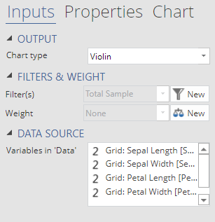
To create this chart, we selected 4 variables in the drop down for Variables from ‘Data’. Variables should be from the same data set. If you use a filter, it will be applied to all of the variables.
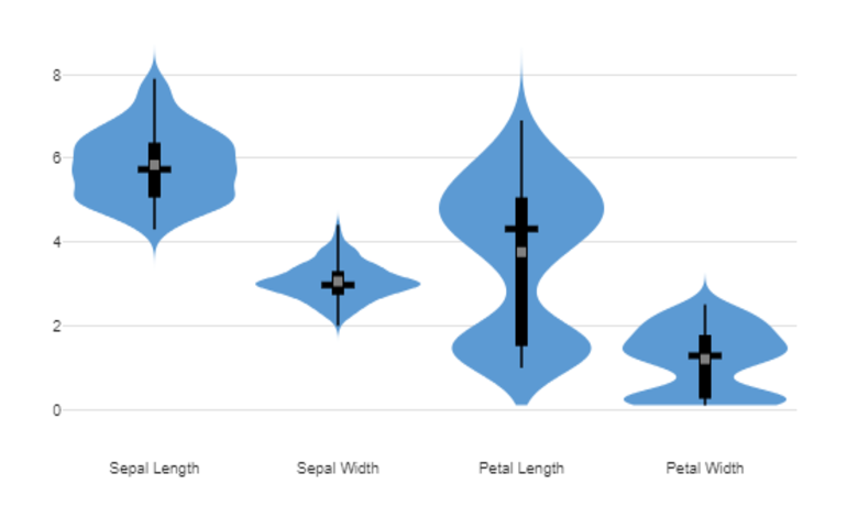
From this chart, we can easily view and compare the shape of the distributions for all variables. The values of Sepal Length and Sepal Width cluster closely around the mean and median. In contrast, Petal Length and Petal Width are multi-modal. Interestingly, only Petal Length has a mean (grey dot) and median (width black bar) that are not overlapping.
3. A Single Variable with groupings
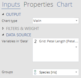
Sometimes we may want to examine a single variable in more depth. For example, do the multiple modes in Petal Length correspond to natural groupings in the data?
From this chart, we can immediately see that petal length differs considerably between species. In particular, the petal length for Setosa is much smaller and more tightly grouped than for Versicolor or Verginica.
4. Output in ‘Pages’
This option is not as commonly used with Violin plots, because most of the menu items in Displayr do not create outputs that are designed to be used with Violin plots. However, it is the most flexible because it can be used with any R output. For example, you can use an R output to combine variables from different data sets. (The disadvantage, however, is that you will not be able to apply filters.)
Customizations
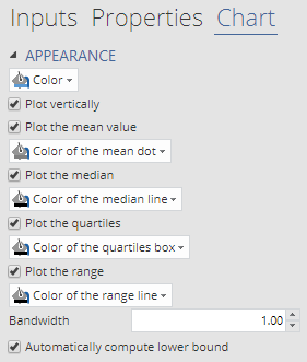 Once your data is entered, you can easily customize the chart appearance by clicking on the Chart tab in the object inspector. By default, the Violin plot will show the mean, median, interquartile range, and range. You can choose to hide any of these elements or show them in a different color. It is often useful to hide features that are less important so they do not distract from the more important features.
You can adjust the density by changing the bandwidth. In most cases, the default bandwidth should work fairly well. But for multi-modal data, you may want to reduce the bandwidth to prevent over-smoothing. On the other hand, if the data is sparse you may need to increase the bandwidth to avoid spurious bumps in your density.
By default, the option to Automatically compute the lower bound is turned on to avoid densities being estimated for negative values. This is why the distribution for Petal Width does not taper off at its lower boundary, unlike the other three variables. If you have values that you know should cover an unconstrained range, then this option should be turned off.
Additionally, you can use a different Chart type without changing the rest of the inputs. Alternatives such as Box Plot, Histogram, Bean, and Density are also useful for visualizing distributions. You can play with all of the examples above here.