
Excel.
Explore the best data cleaning tool options for market researchers. Streamline your analysis and ensure data accuracy effectively.
Continue reading
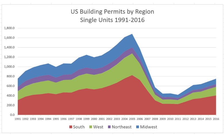
An area chart is based on a line chart, with the area between the line and the x-axis colored to illustrate volume. Learn how to create one in Excel.
Continue reading

Heatmaps are an awesome way of making large amounts of data easier to understand. Discover how to create a heatmap visualization in Excel.
Continue reading
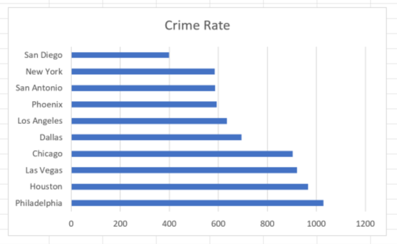
Bar charts in Excel are a staple in every analyst's tool box. Find out how to create one in Excel with this easy to follow guide
Continue reading

Master the art of converting text date formats in Excel. Follow our guide to effortlessly convert text dates for better data analysis.
Continue reading

Any data that's been collected on a numeric scale or as a continuous measurement can be represented as a histogram. Find out how to create one in Excel.
Continue reading

Learn how to create a pie chart easily in Microsoft Excel for effective data visualization and clear presentation of information.
Continue reading

Splitting text strings can be a pain sometimes. This post shows you how to split text strings in Excel with a minimum of fuss.
Continue reading

Radar charts are a great way to visualize two-dimensional data and show differences in sub-groups. I'll show you an easy way to create them in Excel.
Continue reading