
Visualization.

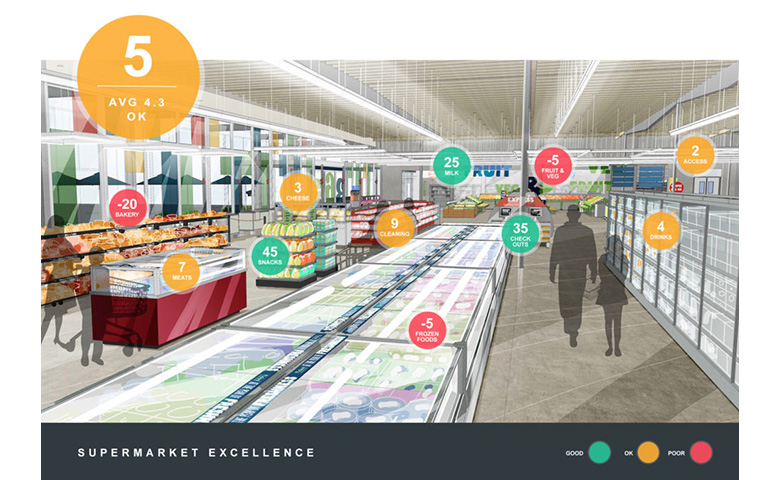
Explore how a market research dashboard can present data in an interactive and visually engaging way for effective storytelling.
Continue reading

Unlock the power of text data visualization to uncover valuable insights and patterns in your business data.
Continue reading

5 ways of presenting the results of key driver analysis techniques, such as Shapley Value, Kruskal Analysis, and Relative Weights.
Continue reading
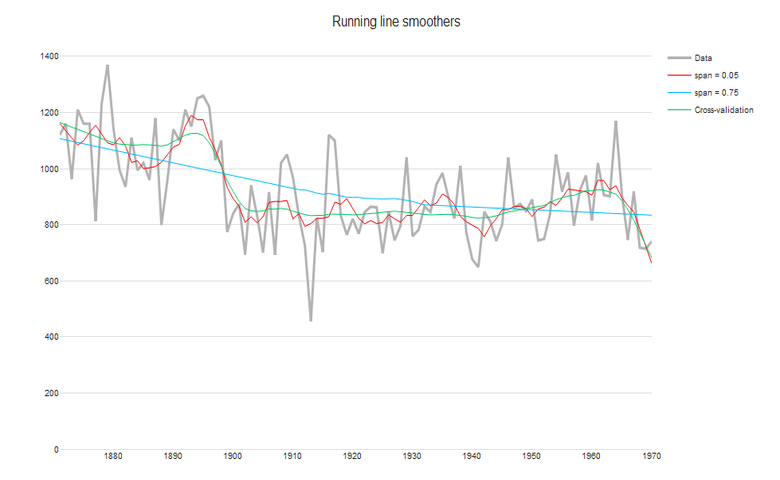
For time-series data, you'll want to separate long-term trends and seasonal changes from random fluctuations. Find out which time smoother to use.
Continue reading
As a graphic designer who designs dashboards, I give you all the tips, tricks, and guidelines for creating a dashboard that everyone will love.
Continue reading
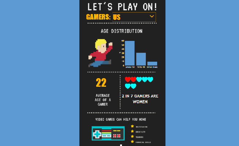
A step-by-step guide on how to create an interactive infographic using an example from Canva, Displayr and R (the R code is included in this post).
Continue reading