
How Correspondence Analysis Works (With Examples)
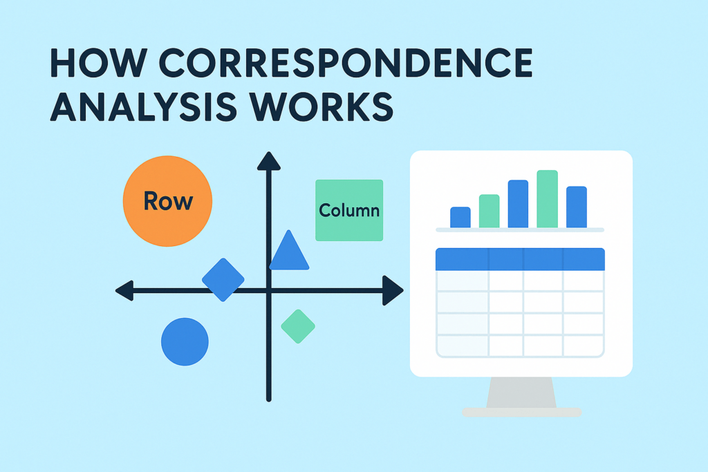
What is correspondence analysis? Correspondence analysis is a data science tool for summarizing tables. It helps you see relationships between categories—like brands and customer opinions, or products and preferences—by turning raw numbers into intuitive visual maps. Instead of getting lost in the rows and columns, you get a clear picture of how things relate. It is […]
How to Interpret Correspondence Analysis Plots (It Probably Isn’t the Way You Think)
Correspondence analysis is a popular data science technique. It takes a large table, and turns it into a seemingly easy-to-read visualization. Unfortunately, it is not quite as easy to read as most people assume. In How correspondence analysis works (a simple explanation), I provide a basic explanation of how to interpret correspondence analysis, so if you […]
Easily Add Images to a Correspondence Analysis Plot in R
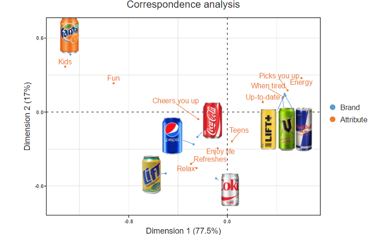
You can take your correspondence analysis plots to the next level by including images. Better still, you don’t need to paste in the images after the analysis is complete – you can include them right from the start. The plot above shows the results of a correspondence analysis based on data from a study of […]
Moonplots: A Better Visualization for Brand Maps
Moonplots are a better way to visualize brand maps than standard correspondence analysis outputs, which are often difficult to read correctly. The Moonplot resolves the key interpretation issues of correspondence analysis and is usually a better alternative. A correspondence analysis is the standard tool for creating brand maps. It shows which brands compete with which […]
Understanding the Math of Correspondence Analysis
If you’ve ever wanted a deeper understanding of what’s going on behind the scenes of correspondence analysis, then this post is for you. Correspondence analysis is a popular tool for visualizing the patterns in large tables. For many practitioners, it is probably a black box. Table goes in, chart comes out. In this post, I […]
Correspondence Analysis of Square Tables

Square tables are data tables where the rows and columns have the same labels, commonly seen as a crosstab of brand switching or brand repertoire data. Correspondence analysis is often used to visualize these tables as a much simpler chart. In this post I discuss the special case of square tables, using examples of cereal brand-switching, and switching […]
How to do Traditional Correspondence Analysis in Displayr
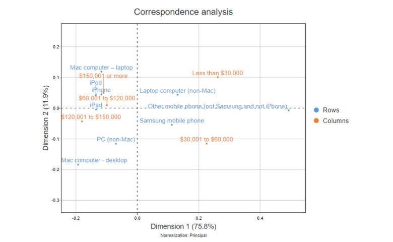
Correspondence analysis is a data analysis technique which summarizes the patterns in a table of data as a visualization. Tables with more than a handful of rows and columns can often become difficult to read, and the patterns can get hidden among the digits. Correspondence analysis can make it much easier to see the story. […]
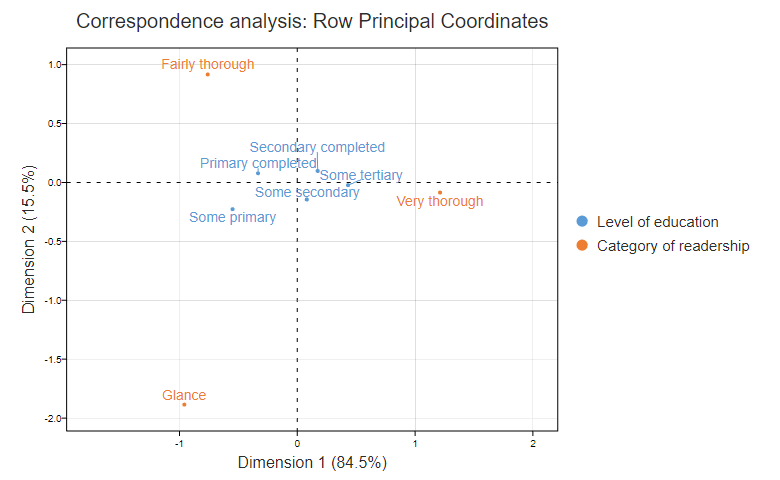
When To Use (And Not Use) Correspondence Analysis
Correspondence analysis is one of those rare data science tools which make things simpler. You start with a big table that is too hard to read, and end with a relatively simple visualization. In this post I explain how you can work out if a table is suitable for correspondence analysis. Correspondence analysis is useful when […]
Adding Supplementary Points To A Correspondence Analysis

Retrospectively adding supplementary points to a correspondence analysis can greatly assist in the interpretation of results. In other words, including supplementary row or column points to a correspondence analysis after the core data has determined the map can improve interpretation of the results. Correspondence analysis is a technique for analyzing tables of data, often used to […]
Using Bubble Charts to Show Significant Relationships and Residuals in Correspondence Analysis
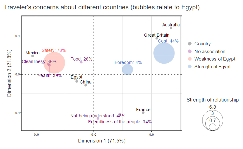
While correspondence analysis does a great job at highlighting relationships in large tables, a practical problem is that correspondence analysis only shows the strongest relationships, and sometimes some of the weaker relationships may be of more interest. One of our users (thanks Katie at JWT!) suggested a solution to this: format the chart to highlight key aspects in […]
Normalization and Scaling in Correspondence Analysis
This post gives recommendations for the best approach to normalization for different situations, making correspondence plots less misleading.
Focusing the Results of Correspondence Analysis in Displayr

Correspondence analysis is often used to visualize a table of data. The goal is to represent as much information as possible, as accurately as possible. However, there may be circumstances when we are interested in a specific row of the table (usually a brand). Such a point may not be represented well in the standard scatterplot output. In […]
3D Correspondence Analysis Plots in R Using Plotly
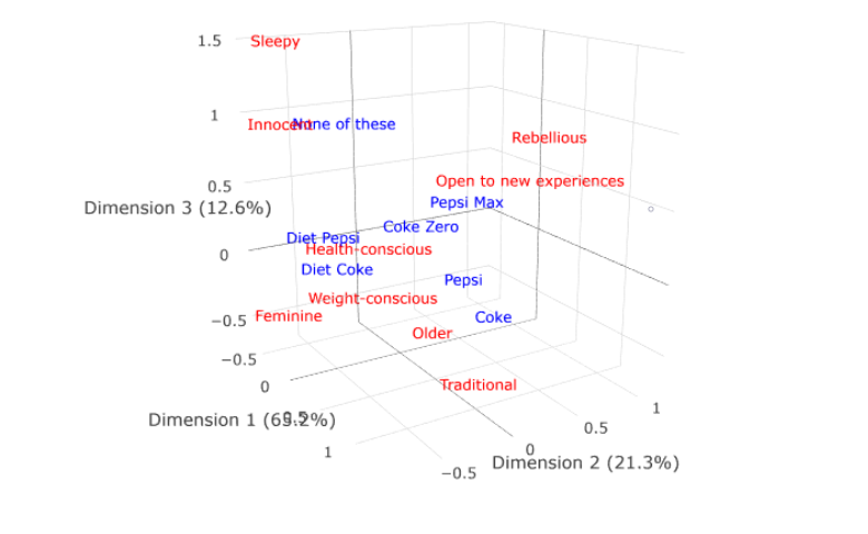
In this post I show how Plotly can be used to create interactive 3D visualizations of correspondence analysis. Back in the “olden days” of the 1970s it was apparently not unknown for statisticians to create 3D visualizations using tinkertoys. For some inexplicable reason, the advent of the PC led to a decline in this practice, with the […]
3D Correspondence Analysis Plots in Displayr

In this post I show you to create 3D visualizations of correspondence analysis using Displayr. This allows you to view an extra dimension of your data (and looks great too!). Traditional correspondence analysis Traditional correspondence analysis plots typically plot the first two dimensions of a correspondence analysis. Sometimes, additional insight can be gained by plotting […]
Customization of Bubble Charts for Correspondence Analysis in Displayr

When you insert a bubble chart in Displayr (Insert > Visualization > Bubbleplot), you can customize some aspects of its appearance from the controls that appear in the object inspector on the right of the screen. More advanced customizations can be performed by instead inserting an R Output (Insert > R Output), and writing code. I illustrate this by explaining how I created the […]
Easily Add Images to a Correspondence Analysis Map in Displayr
You can take your correspondence analysis plots to the next level by including images. Better still, you don’t need to paste in the images after the analysis is complete – you can include them right from the start. The visualization above shows the results of a correspondence analysis based on data from a study of […]
Learn More about Dimension Reduction in Displayr

Correspondence Analysis Webinar: DIY Market Mapping Using Correspondence Analysis Ebook: DIY Correspondence Analysis How Correspondence Analysis Works (A Simple Explanation) Understanding the Math of Correspondence Analysis How to Interpret Correspondence Analysis Plots Correspondence Analysis Versus Multiple Correspondence Analysis Principal Component Analysis Principal Component Analysis (Wiki example) How to Do Principal Components Analysis in Displayr The […]
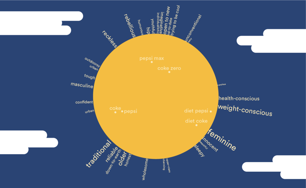
Rotate Your Correspondence Analysis to Better Understand Your Brand Positioning

Correspondence analysis is perhaps the most widely used multivariate tool in market research. It’s our “go to” tool for displaying complex tables, such as brand association tables. A practical challenge with correspondence analysis is that it is designed to best show all of the relationships in the data, but sometimes we are more interested in one particular […]
Correspondence Analysis Versus Multiple Correspondence Analysis: Which to Use and When?

In this post I explain the difference between the two techniques, and their relative strengths and weaknesses. I assume that you already are familiar with correspondence analysis, but if not, then consider first reading How correspondence analysis works (a simple explanation). The core difference between correspondence analysis and multiple correspondence analysis The name, rather obviously, suggests that […]
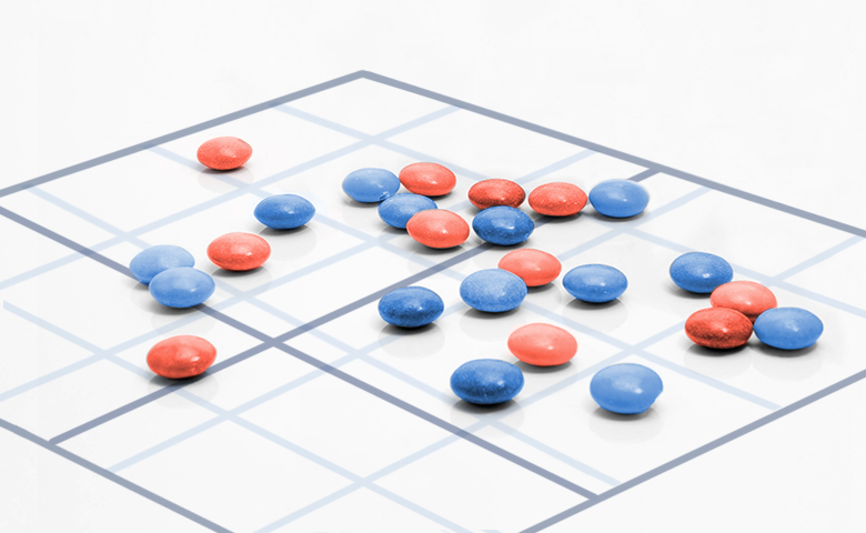
Using Correspondence Analysis to Find Patterns in Tables
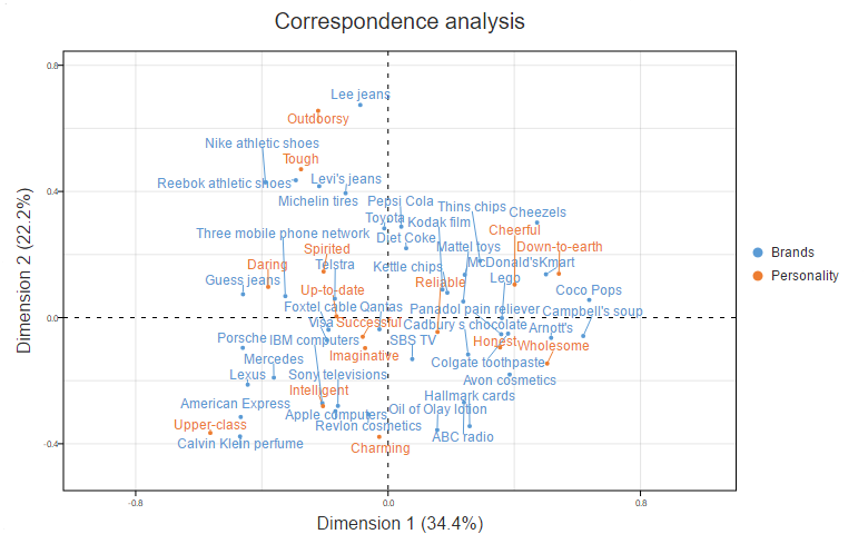
There are lots of great visualizations designed for analyzing big quantities of data. Heatmaps, for example, are super-popular. However, when I am in a rush, my “go to” approach to analyzing big tables is almost always correspondence analysis. Although a bit more technical, it tends to get me to the key insights much faster. A Correspondence […]