
AI Research Agent vs Traditional Survey Analysis: Speed, Accuracy & Cost Compared

The average insights team spends 60–70% of their project time on analysis mechanics: cleaning data, building tables, coding responses, and formatting outputs. AI promises to change that. But how does it actually compare to the tools most researchers already use? This post runs a direct comparison between an AI research agent and three traditional workflows: […]
How to Make a Heatmap in Excel

Creating a heatmap in Excel is the fastest way to spot patterns in large tables — no charts needed, just conditional formatting. This guide walks through the exact steps, plus best practice tips for colour scales and readability. Don’t forget that you can easily use Displayr’s heatmap maker to create your free heatmap! What’s a heatmap? A […]
How to Split Text Strings in Excel
This guide shows how to split text strings in Excel using built-in functions like LEFT, RIGHT, MID, and TEXTSPLIT — no macros or add-ins required. What is a Text String? A text string is any sequence of characters consisting of either numbers, letters, or symbols. These strings can commonly hold meaning as in dates (05/04/15), […]
Data Cleaning Tools & Software (AI-Powered Options for Market Research)

TL;DR: Today, data cleaning tools (also called data cleansing software) often include AI-powered features that automatically detect errors, duplicates, and outliers. These tools are essential for market researchers, improving the accuracy and reliability of survey analysis by removing errors and inconsistencies. This guide explores the pros and cons of various data cleaning tools, emphasizing the […]
How to Make an Area Chart in Excel (Updated 2026 Guide)
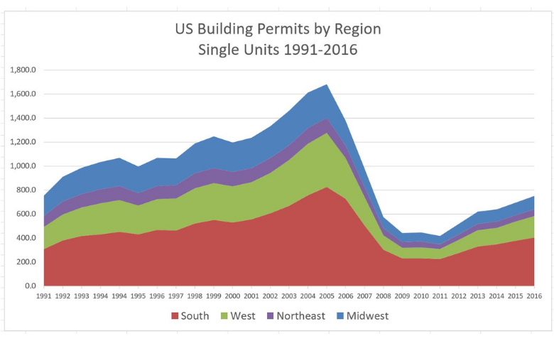
An area chart is based on a line chart, with the area between the line and the x-axis colored to illustrate volume. In this post, we’ll explore how to create a standard area chart and a stacked area chart in Excel, as well as some common issues to look out for. Don’t forget though, you […]
How to Create a Bar Chart in Excel
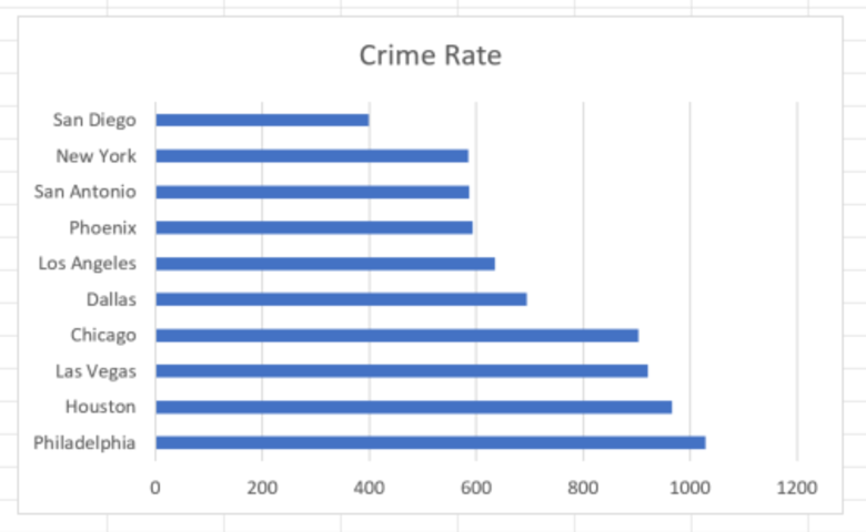
Microsoft Excel has been used to create charts and visualizations for as long as (or longer than) any other application being used today. In fact, Microsoft released the first version of Excel back in 1985! While there are certainly drawbacks associated with using Excel for visualizations, especially in terms of data centralization and file version […]
How to Convert Text Dates in Excel

Having trouble converting text dates in Excel? Today, I’ll show you how you can easily work with textual dates in Excel. Set yourself up For a general overview of how to convert text date formats in Excel, see my previous article How to Convert Text Dates to Numeric. The first step in analyzing data in […]
How to Make a Histogram in Excel

Any data that’s been collected on a numeric scale or as a continuous measurement can be represented as a histogram. These constitute a fairly traditional way of displaying the shape of the distribution of your data and are often used as the foundation for more advanced statistical analysis, such as working out medians, averages, and […]
How to Create a Pie Chart in Excel

Creating a pie chart is extremely easy using Microsoft Excel. In this article, we’ll look at how to create a basic pie using Excel. Pie charts 101 Pie charts are among the most common data visualization charts. Put simply; pie charts show how different portions combine to form a whole. This makes them ideal for […]
How to Make a Radar Chart in Excel

Radar charts are a great way to visualize two-dimensional data and show the differences between sub-groups. Think of them as a line chart that’s been wrapped around a central point, where the y-axis of the line chart starts from the central point and extends upwards. The lines will also wrap around the central point and […]