
Sankey.
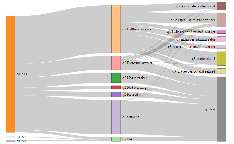
If you have spent much time analyzing survey data, then you have probably spent a lot of time validating it. Unless you use a Sankey diagram.
Continue reading
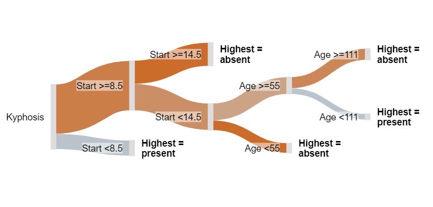
Sankey diagrams are not just a cool visualization that looks good, they are perfect for displaying decision trees (e.g., CHART, CHAID).
Continue reading
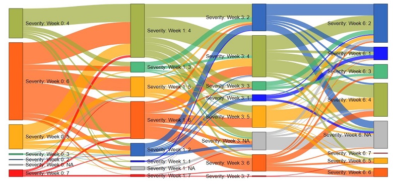
Sankey diagrams are useful for visualizing relationships between variables. By applying different color schemes, we can highlight structures in the data.
Continue reading
In this post, I'll show you how to create a Sankey Diagram using R, when your data has been set up as a table. It's easier than you think.
Continue reading
You can use Displayr to easily create a Sankey diagram from data which is in a table format. This post shows you how to create your own Sankey diagram.
Continue reading
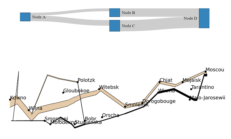
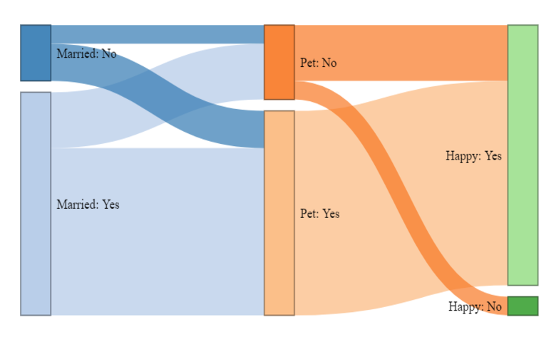
This posts describes how to create custom Sankey diagrams in R. It explains the basics of Sankey diagrams and provides examples of different layouts.
Continue reading