This page collates together material that follows some simple guidelines and practical tips to help you easily make clean effective reports using Displayr.
Plan and gather requirements

The planning phase is where it all begins. Once the scope of the dashboard project has been defined, the process of gathering requirements begins. This is probably the most important step in the process of designing a dashboard. Before jumping into the design stage of your dashboard project, you need to start with a plan that has clear objectives. Consider the five Ws:
Who: Who is the intended audience? Make a list of the stakeholders, decision-makers, and end-users of your report.
What: What is the purpose of the dashboard? What are you trying to achieve? What data is needed? What is the timeline?
Where: Where does the data come from? Is it just survey data or in combination with other sources?
When: Is it a one-off data extract or a report that requires a periodic refresh. If the latter, when, and how frequently should the data be refreshed?
Why: Why do you need to develop the dashboard report?
5 things to consider before building your dashboard: Designing a dashboard is more of an art than a science.
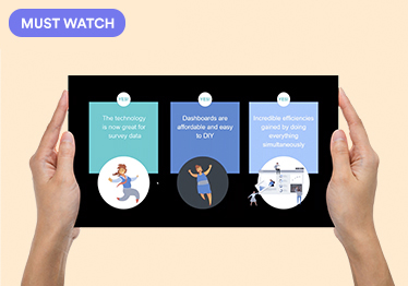
Ideation

It is now time to put more thought into what the final product will look like. Explore these examples of dashboards created in Displayr, to get some inspiration:
Create a simple dashboard: This case study shows you how to create a simple dashboard using a very cool visualization.
8 types of online dashboards: What type of online dashboard will work best for your data? This post reviews eight different types of online dashboards.
Visualize your customer satisfaction data: Customer satisfaction is a valuable customer feedback metric. Here are the four visualizations to find stories in your customer satisfaction data.
Displayr dashboard showcase: This post provides examples of different types of Dashboards created in Displayr. For each dashboard you can both view the dashboard in View mode, and edit the dashboard in Edit mode, to see how it works.
Dashboard example gallery: See some more examples of dashboards that have been created in Displayr.
Design: Consistency is key
The job of your report is to help convey information as efficiently and clearly as possible. Consistency is key, by keeping the theme and design consistent, you’re allowing the story and data to stand out.
Create a document template: Just like in PowerPoint, you can create templates for your company, and for specific clients, using Displayr. These templates can set things like color formatting in charts and tables, backgrounds, fonts, and statistical assumptions.
Create a visualization template: This blog post shows you how to create a template for setting colors and font styles for all your Displayr visualizations. This will save you having to manually create or copy and paste your visualizations to retain your style settings.
Create a color palette: While most visualizations have built-in color palettes, more often than not you’ll want or need to customize them. Set up a color palette BEFORE you start making a dashboard in Displayr. This will help you craft a beautiful dashboard and it will save you a lot of time in the long-run! We highly recommend doing this as a preparation step before you embark on creating your Displayr document.
Customize the look and feel of tables: This post describes the six main ways of customizing the look and feel of tables in Displayr
Customize colors within a data series: In Displayr, you can customize the colors within a series for bar charts, column charts, and pyramids created using Insert > Visualization. This can make visualizations more informative and engaging.
Customize logos, CSS, HTML headers, and the language: In addition to the content and formatting that you use when creating a Displayr document, you can also
- Customize the overall look of the document, for example, the appearance of the navigation, and how the document name appears.
- Customize the logo that is shown when people create a link to a Displayr document on an iPad.
- Specify the language that is used by people in View mode, such as the words used on the login screens.
Build

It is easy to make the wrong choices when building a report, you don’t want to end up losing your audience or cluttering your message. The layout and choice of data visualizations have the same goal. That is, to help viewers easily grasp information to make quick inferences or decisions. Below are some general rules to follow:
- Choose the right visualization for each metric. Visualizing data poorly can become more confusing than helpful.
- Leverage the natural reading pattern to present information in an intuitive manner.
- Group related KPIs and metrics together and use the space wisely.
- Use size and position to show hierarchies and make priorities clear.
- Use the data to tell a story, give numbers context, label things clearly, round numbers for simplicity, highlight key information.
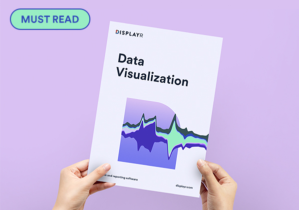
eBook: Data Visualization: This book is designed to help you craft visualizations that instantly allow your audience to grasp – and remember – the story of your data.
Webinar: How to create visualizations to synthesize survey data: A webinar that walks you through how to create visualizations to synthesize survey data making sure they are instantly meaningful, memorable, and insightful.
Webinar: How to Create Meaningful, Memorable, Instantly Understandable VisualizationsMeaningful, memorable, instantly understandable. Are these words used to describe your data visualizations? They can be! Watch now to learn how to create market research visualizations that are easy and quick to digest and improve storytelling.
Webinar: The 5 Second Rule for Data Viz: OK, so you know the basics of data viz. But do you know how to create a great visualization? Can your data viz be digested in 5 seconds or less? This webinar will show you the essential tricks to shape data so that people instinctively “get it.”
Webinar: Discover New Ways to Visualize Market Research Data: The webinar shows how to create visualizations that improve storytelling. It focuses exclusively on visualizations that work with standard market research data.
Learn about the different visualizations: All blog posts about a chart or visualization type specifically, or which contains details on how to work with specific types of visualizations.
Learn more about Displayr visualizations: The page gathers together the different materials we have on our Visualizations and how they work.
Where pictographs beat bar charts count data: Pictographs are particularly useful for displaying small count data.
It Is Not the Size That Counts: Small Visualizations Are Preferable to Large Visualizations: All else being equal, small visualizations are better than big visualizations.
Charts versus Visualizations versus Plots: Which to Use When: Within Displayr, there are different ways of visualizing your data.
Adding Icons to Dashboards Using Font Awesome: This post shows how to add novel symbols, from ambulances through to arrows, to Displayr documents. These symbols are part of the Font Awesome font.
12 Visualizations to Show a Single Number: Infographics, dashboards, and reports often need to highlight or visualize a single number.
Learn more about filtering in Displayr: This page collates the different materials we have on how to filter data in Displayr. The topics cover:
- Creating and applying binary filters from different sources.
- How to filter tables, visualizations, and R outputs using built-in data manipulations and code.
- How to filter entire pages and documents via control boxes and view-mode filter selections.
How to use the same control on multiple pages: You can now create pages that show the same controls (e.g. drop-downs) in your documents.
Optimize and refresh

Optimize the speed of Displayr documents: Sometimes a Displayr document is slower than is needed. This page describes the root causes of slowness and strategies for improving speed. Many of these strategies are more advanced and you can contact [email protected] for more guidance in working through a specific issue.
Automatic updating: Displayr makes it easy, and fast to update your analysis, visualizations, reports, and dashboards.
Automatically updating R Outputs, R Variables, and R Data Sets: R Outputs, R Variables, and R Data Sets can be made to refresh automatically after a specified time period by including a line of code with a message or a function call.
Creating dashboards with real-time updating: Sometimes it is useful for dashboards to update in “real-time”. Typically, this is where the data is rapidly changing, and the view of the data from one moment is different from the next.
Update a Displayr report with a direct download link: How to implement a workflow solution in order to automatically update data in a Displayr dashboard.
Maintain

Designing and creating a dashboard report is an iterative and evolving process. It is important to test, evaluate, and tweak your dashboards. User-driven feedback allows you to make your dashboard as effective as possible, and address the specific objectives of your audience.
If you need help implementing any of these designs, don’t hesitate to reach out to our global support team at [email protected].