
How To Visualize Distributions with Heatmap-Colored Density Plots in R
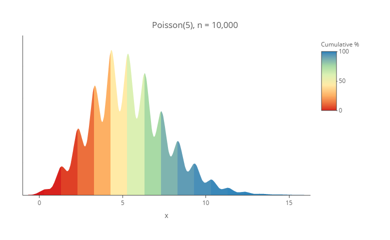
You can use Displayr’s density plot maker to create your own density plot for free. Lots of different visualizations have been proposed for understanding distributions. In this post, I am going show how to create my current favorite, which is a density plot using heatmap shading. I find them particularly useful for showing duration data. […]
Heatmap Shading on Tables and Charts

There are three different ways of creating heatmaps in Displayr. You can create a heatmap visualization. You can create a segment comparison table (Insert > Group/Segment > Segment Comparison Table). And, you can add heatmap shading to any table or chart. This post describes how to add the shading to any table or chart. Example […]
Making Your Data Hot: Heatmaps for the Display of Large Tables
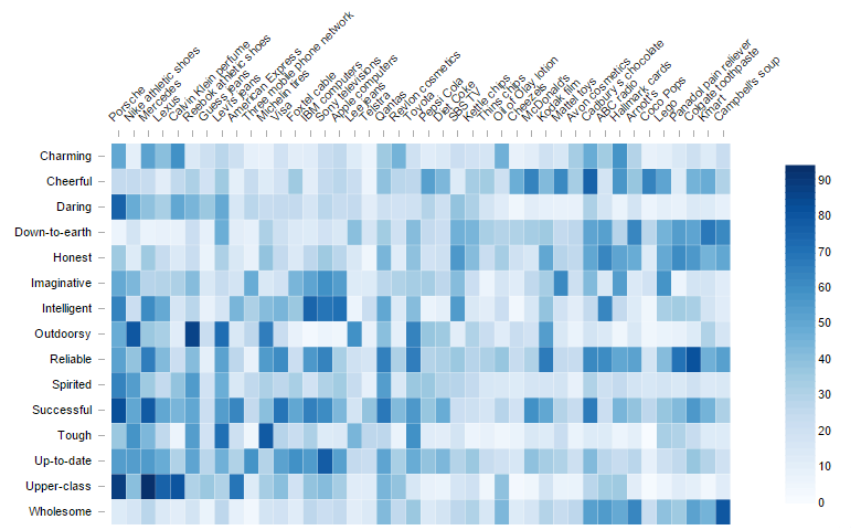
Don’t forget that you can easily use Displayr’s heatmap maker to create your free heatmap! Sometimes tables are just too big to read. The table below shows the personality attributes that people associate with different iconic brands. A table too big to read easily and too big to show elegantly on a web page, in this case, […]
Too Hot to Handle? The Problem with Heatmaps
Heatmaps are cool. Most people like them. They are so much prettier than a bar chart. The one below, created in Making your data hot: heatmaps for the display of large tables, is both nice to look at and informative. However, basic psychology tells us that these heatmaps are easy to misread. The problem is that […]
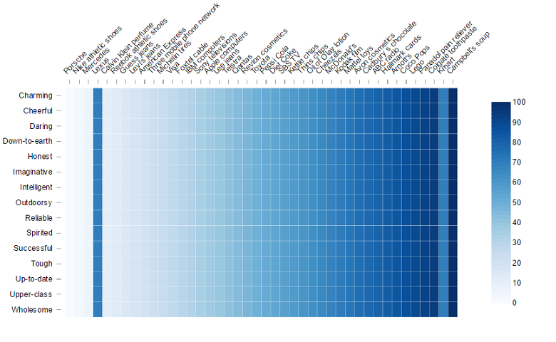
2 Rules for Coloring Heatmaps so That Nobody Gets Burnt
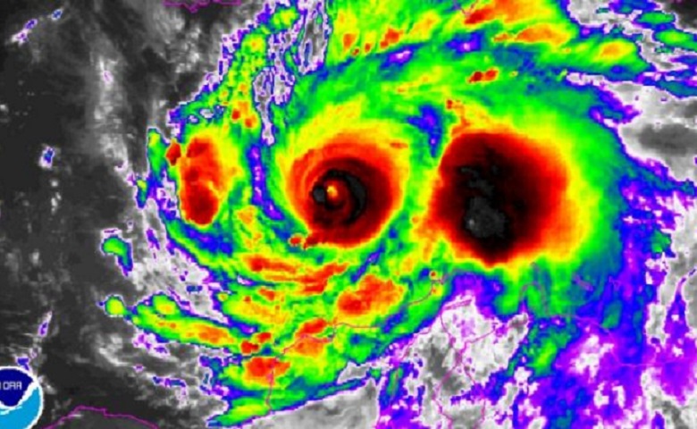
Don’t forget that you can easily use Displayr’s heatmap maker to create your free heatmap! The other day, my local paper showed what it called a “photo” of Hurricane Matthew. This heatmap achieves one of the core jobs of visualization: it attracts attention. However, it does so at too high a cost for me because of its poor use […]
How to Create a Heatmap in Displayr
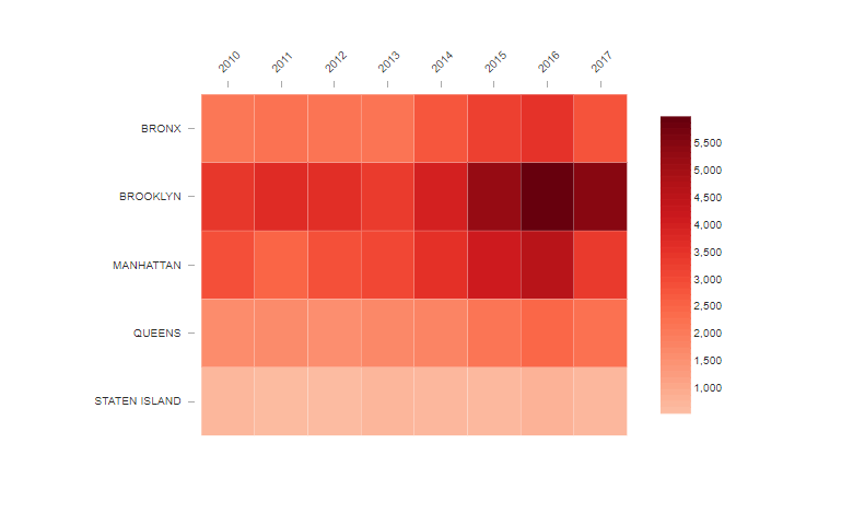
Heatmaps are a great way to pick up patterns in tables of data. The heatmap represents the table by shading the cells according to the values in the table. Rather than squinting your way through a huge series of numbers trying to pick out which ones are higher or lower the dimension of color makes […]