
Heatmap.
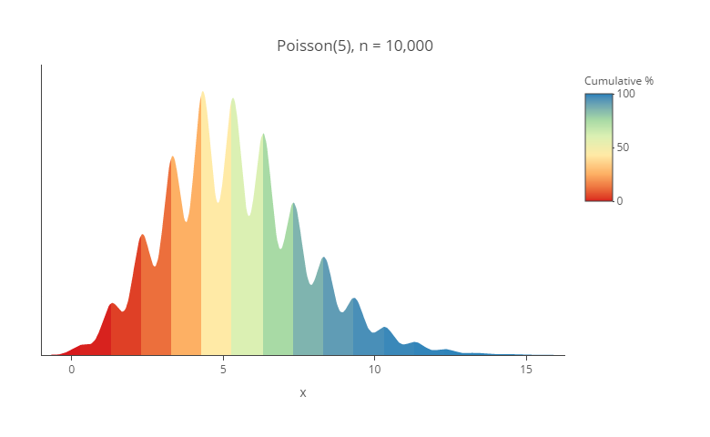
Learn the best techniques for visualizing distributions with density plots. Discover how to create a density plot easily today.
Continue reading

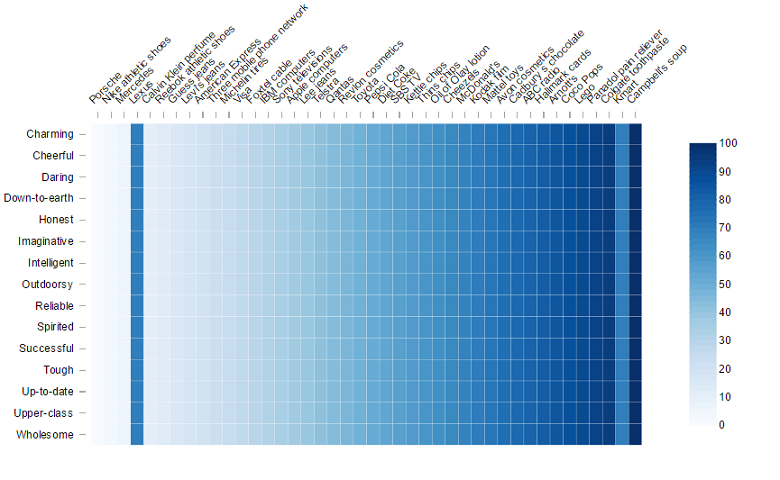
Master heatmap shading techniques in Displayr with our step-by-step guide for improved visual insights.
Continue reading
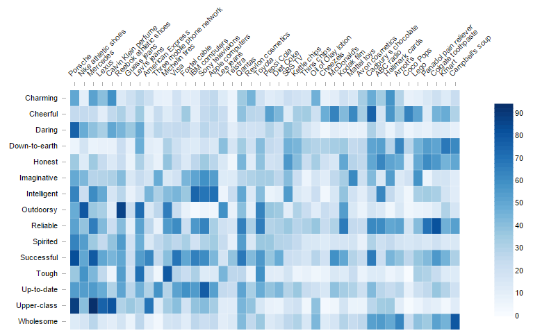
A heatmap, which replaces the numbers with colors or shades proportional to the numbers in the cell, is a lot easier for our brains to digest than a table.
Continue reading
Heatmaps are cool. Most people like them. They are so much prettier than a bar chart. However, psychology tells us that these heatmaps are easy to misread.
Continue reading
This heatmap achieves one of the core jobs of visualization: it attracts attention. It does so at too high a cost for me because of its poor use of color.
Continue reading
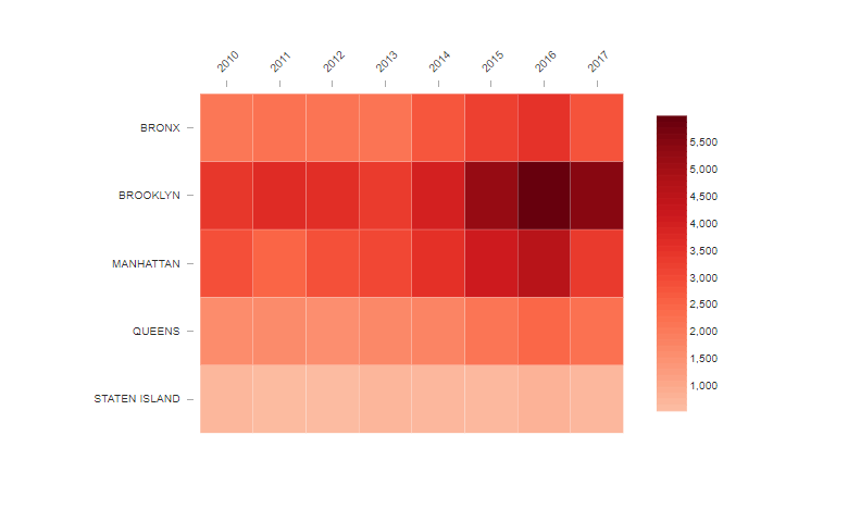
Heatmaps are a great way to pick up patterns in tables of data. The heatmap represents the table by shading the cells according to the…
Continue reading