
5 Ways to Visualize Relative Importance Scores from Key Driver Analysis

Key driver analysis techniques, such as Shapley Value, Kruskal Analysis, and Relative Weights, are useful for working out the most important predictor variables for some outcome of interest (e.g., the drivers of satisfaction or NPS). But, what is the best way to report them? In this post, I illustrate 5 ways of presenting the results […]
Why Pie Charts Are Better Than Bar Charts

Ok, ok, this blog’s title would be a bit more accurate if the word “often” appeared in the title. In my defense, all the anti-pie chart trolling provoked me! Troll HQ, Wikipedia, writes “Statisticians generally regard pie charts as a poor method of displaying information”. Ouch! And a curious error of logic hides here. Let […]
Customizing Colors Within a Series on a Bar, Column, or Pyramid Visualization

In Displayr, you can customize the colors within a series for bar charts, column charts, and pyramids created using Insert > Visualization. This can make visualizations more informative and engaging. The normal boring use of color The bar chart below is the default bar chart created by Displayr. Color is merely adornment on this chart; […]
Pictograph vs Bar Chart: Which One Should You Use?

When visualizing data, choosing the right type of chart is essential. Two commonly used formats—pictographs and bar charts—offer different strengths. In this post, we’ll compare the two by first explaining what they are, then exploring when and why pictographs can sometimes outperform bar charts. What is a Pictograph? A pictograph (or pictogram) is a chart […]
How To Use Sparklines To Show Trends In Charts
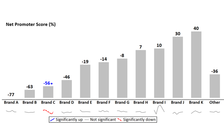
Adding sparklines to a line chart that has multiple series of data can vastly improve readability and interpretation. Line charts are one of the standard charts used in tracking market research. But, as soon as they have more than a couple of series of data, they tend to be awful. This is aptly illustrated by […]
How to Create a Bar Chart in Displayr
You can easily create professional and beautiful bar graphs or bar charts in Displayr for free! Check out Displayr’s free bar graph maker. Two Methods and Four Chart Types There are two methods of creating charts in Displayr. The first is to simply change the way you table is displayed to a Chart. The second is […]
Where Pictographs Beat Bar Charts: Count Data
Don’t forget you can create free pictographs using Displayr’s pictograph maker. Pictographs are often subject to ridicule. They are seen to compromise interpretability in favor of glitz. They are only “for kids”: an undeserved reputation which neglects situations where pictographs outperform bar charts. One such situation is for small count data. Look at the pictograph example above. […]