
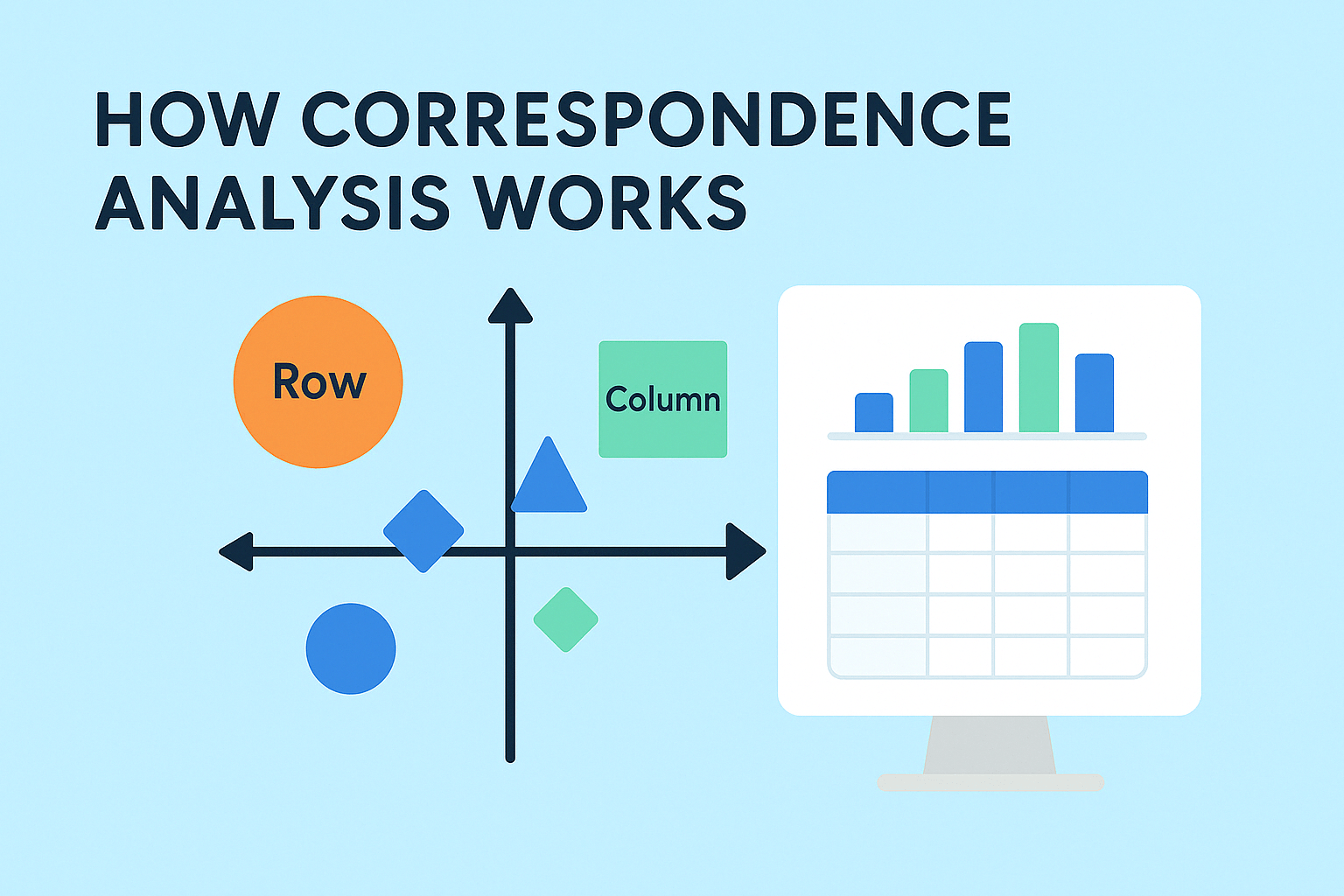
Correspondence Analysis.
Explore correspondence analysis to visualize data and uncover relationships between categories. Simple methods explained.
Continue reading
Unlock the complexity of data visualization with our guide on how to interpret correspondence analysis for better insights.
Continue reading
You can take your correspondence analysis plots to the next level by including images. This post describes how to create this plot using R.
Continue reading
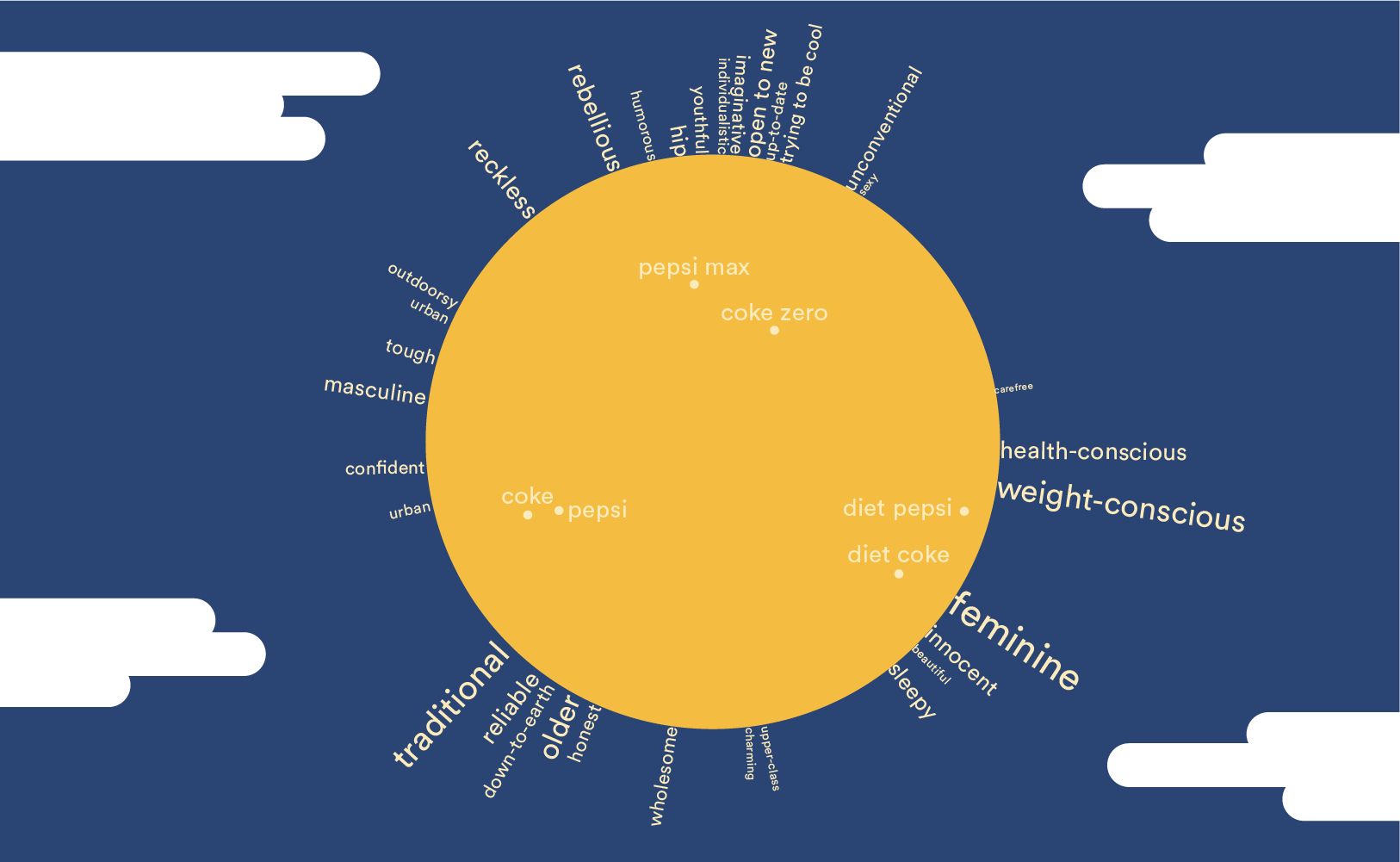
Correspondence analysis outputs are difficult to read correctly. Moonplots are a better alternative to brand maps because they are much easier to interpret.
Continue reading
If you've ever wanted a deeper understanding of what's going on behind the scenes of Correspondence analysis, then this post is for you. Examples are in R.
Continue reading

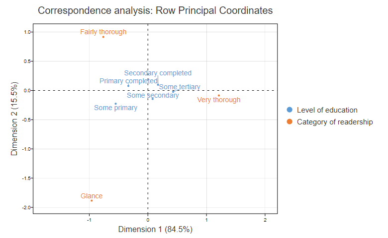
In this post I discuss the special case of Correspondence Analysis with square tables. Such tables often arise in the context of brand switching.
Continue reading
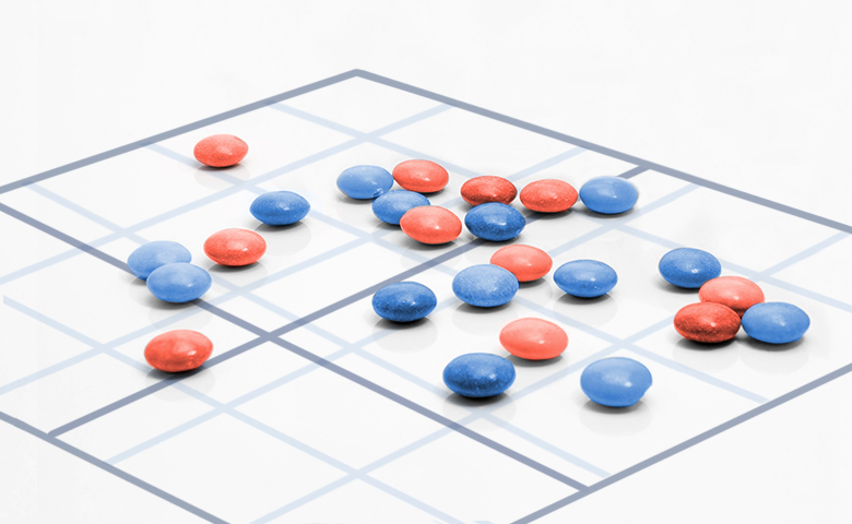
Correspondence analysis is a data analysis technique which summarizes the patterns in a table of data as a visualization. Learn how to create your own.
Continue reading
Unlock the power of correspondence analysis to simplify complex data tables into clear visualizations for better insights.
Continue reading

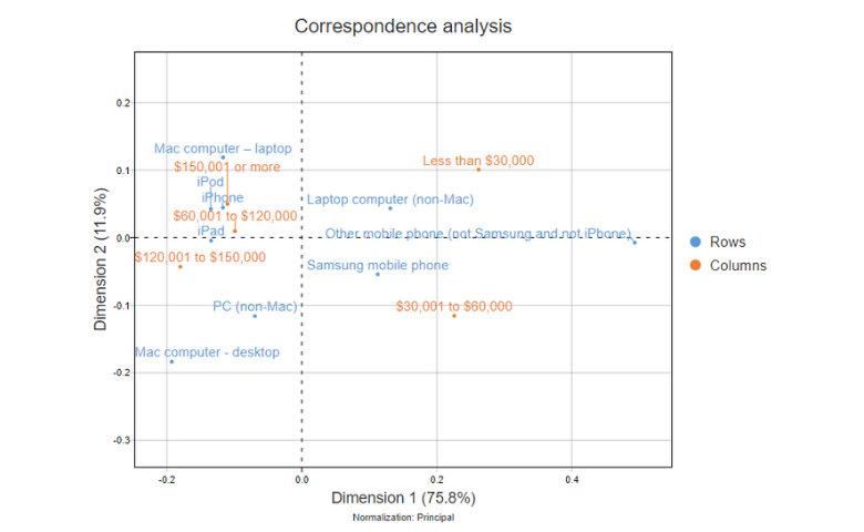
Supplementary points of data can be added to a "core" correspondence analysis to aid interpretation without influencing the placement of core data.
Continue reading
While correspondence analysis does a great job at highlighting relationships in large tables, a practical problem is that correspondence analysis only shows
Continue reading
This post gives recommendations for the best approach to normalization for different situations, making correspondence plots less misleading.
Continue reading

Correspondence analysis is often used to visualize a table of data. The goal is to represent as much information as possible, as accurately as possible. However,…
Continue reading
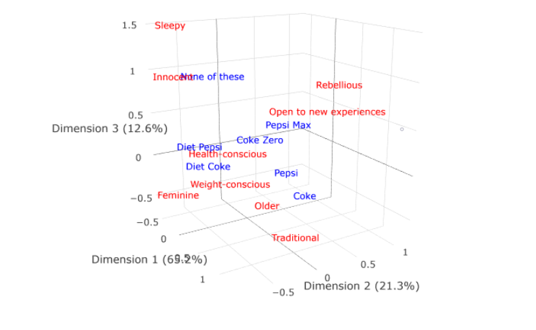
Plotly can be used to create interactive, 3D visualizations of correspondence analysis. You can publish these as online dashboards using Displayr.
Continue reading

Displayr allows you to create 3D correspondence analysis plots. These show three dimensions of data instead of only 2, and look awesome too!
Continue reading
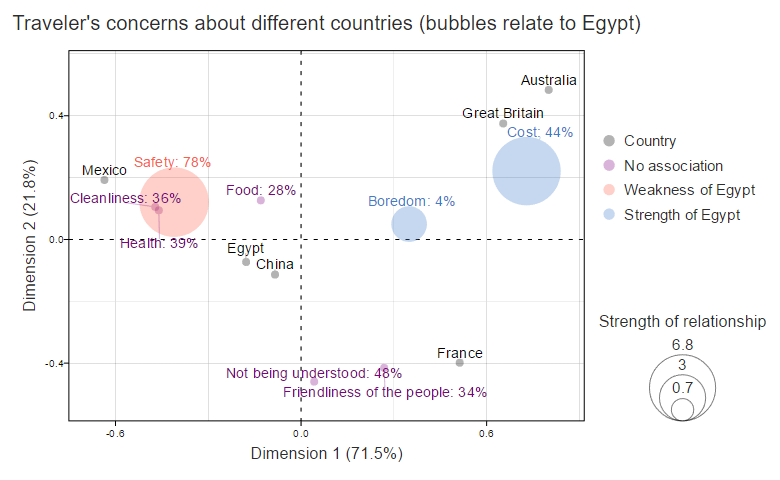
Advanced Customization of Bubble Charts for Correspondence Analysis in Displayr for when weak relationships are interesting.
Continue reading
You can take your correspondence analysis plots to the next level by including images. Better still, you can include them from the start of your analysis.
Continue reading

Correspondence Analysis Webinar: DIY Market Mapping Using Correspondence Analysis Ebook: DIY Correspondence Analysis How Correspondence Analysis Works (A Simple Explanation) Understanding the Math of Correspondence…
Continue reading

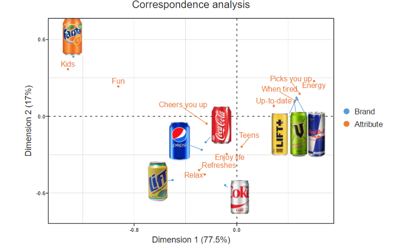
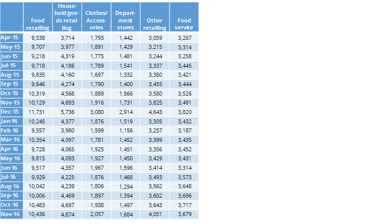
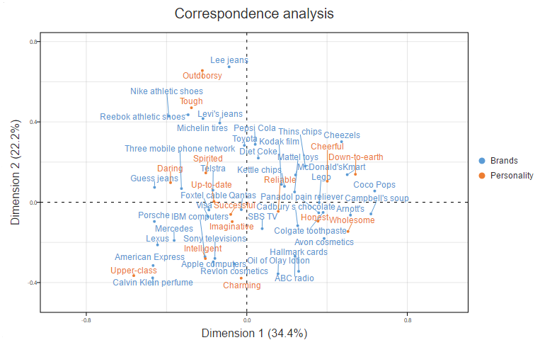
Correspondence analysis is perhaps the most widely used multivariate tool in market research. It’s our “go to” tool for displaying complex tables, such as brand…
Continue reading

Continue reading
Correspondence analysis is a great tool for analyzing big quantities of data, uncovering the key insights faster then visualizations like Heatmaps.
Continue reading