The page gathers together the different materials we have on our Visualizations and how they work.
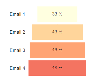
Column Charts
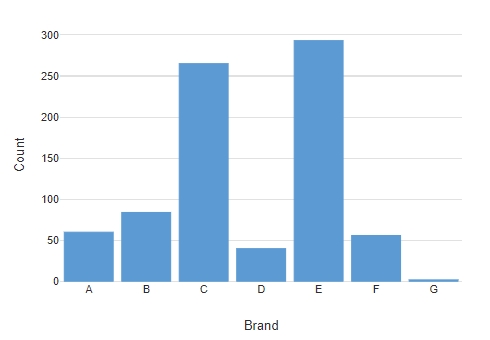
How to Make a Column Chart in Displayr
Customizing Colors Within a Series on a Bar, Column, or Pyramid Visualization
How To Add a Line to a Column Chart
Using Sparklines to Show Trends in Bar and Column Charts
Technical Documentation: Small Multiples Column Chart
Histogram
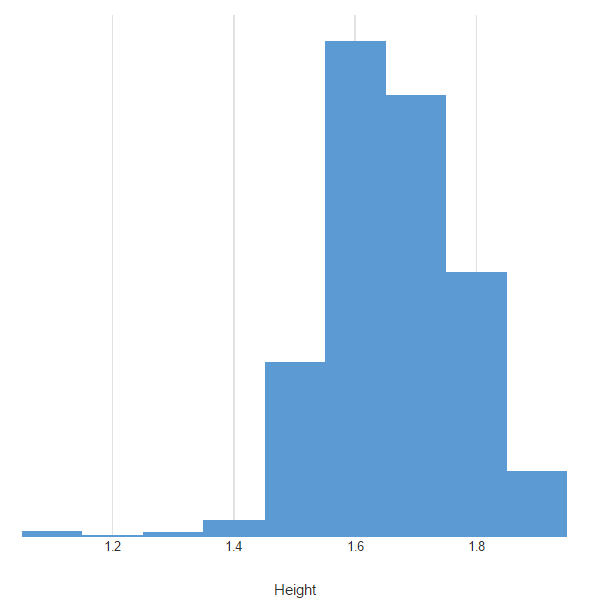
How to Make a Histogram in Displayr
Technical Documentation: Histogram
Bar Charts
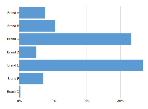
How to Create a Bar Chart in Displayr
Customizing Colors Within a Series on a Bar, Column, or Pyramid Visualization
7 Alternatives to Word Clouds for Visualizing Long Lists of Data
Why Pie Charts Are Better Than Bar Charts
Where Pictographs Beat Bar Charts: Proportional Data
Where Pictographs Beat Bar Charts: Count Data
5 Ways to Visualize Relative Importance Scores from Key Driver Analysis
Using Sparklines to Show Trends in Bar and Column Charts
Technical Documentation: Bar Chart
Technical Documentation: Pictograph Bar Chart
Technical Documentation: Small Multiples Bar Chart
Pyramid Charts
How to Create a Pyramid Chart in Displayr
Customizing Colors Within a Series on a Bar, Column, or Pyramid Visualization
Technical Documentation: Pyramid Chart
Line Charts
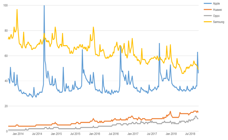
How to Create a Line Chart in Displayr
Using Sparklines to Show Trends in Bar and Column Charts
How To Add a Line to a Column Chart
Technical Documentation: Small Multiples Line Chart
Time Series Graph
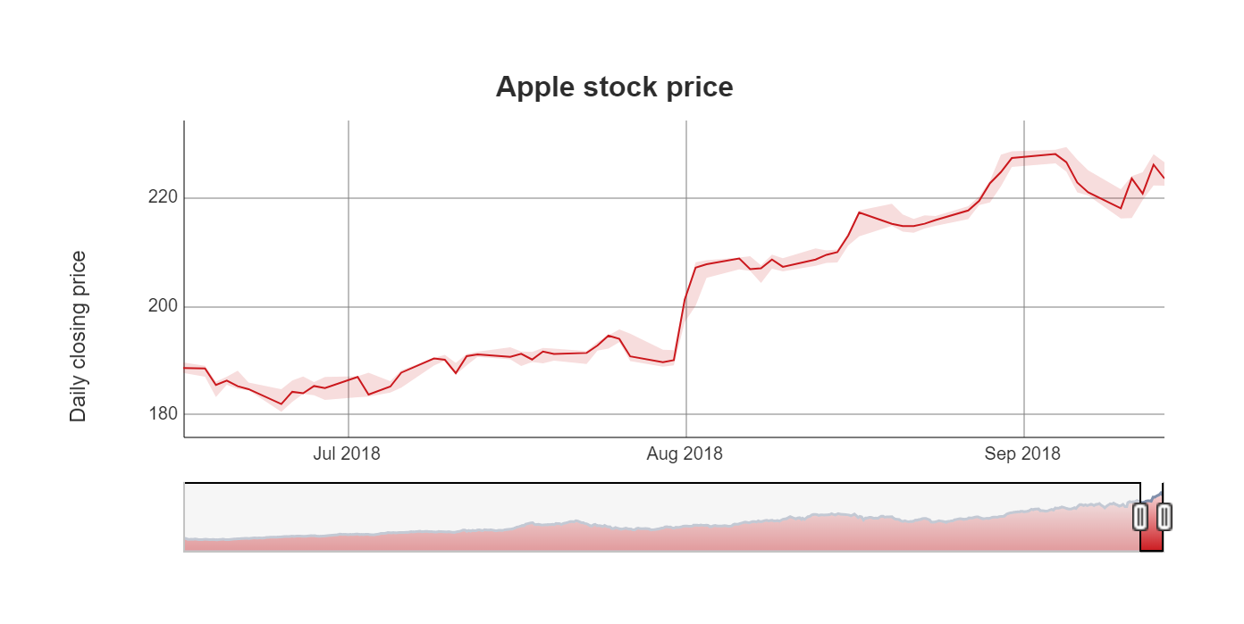
How to Create a Time Series Graph in Displayr
2 Ways to Smooth Time Series in Displayr
Technical Documentation: Time Series Graph
Area Chart
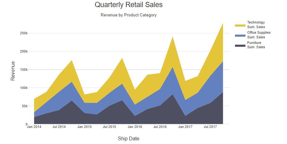
How to Make an Area Chart in Displayr
Technical Documentation: Small Multiples Area Chart
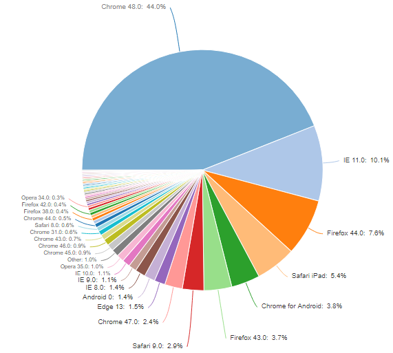
Pie and Donut Charts
How to Create a Pie Chart in Displayr
What’s Better Than Two Pie Charts?
7 Alternatives to Word Clouds for Visualizing Long Lists of Data
5 Ways to Visualize Relative Importance Scores from Key Driver Analysis
A Pie Chart for Pi Day: The Data Scientist Pie Eating Challenge
Why Pie Charts Are Better Than Bar Charts
Technical Documentation: Pie Chart
Technical Documentation: Donut Chart
Technical Documentation: Number in Donut
Radar Charts
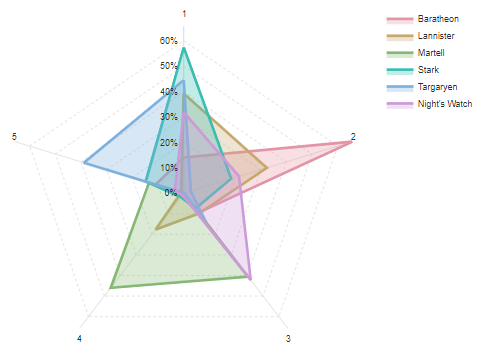
How to Make a Radar Chart in Displayr
Technical Documentation: Radar Chart
Technical Documentation: Small Multiples Radar Chart
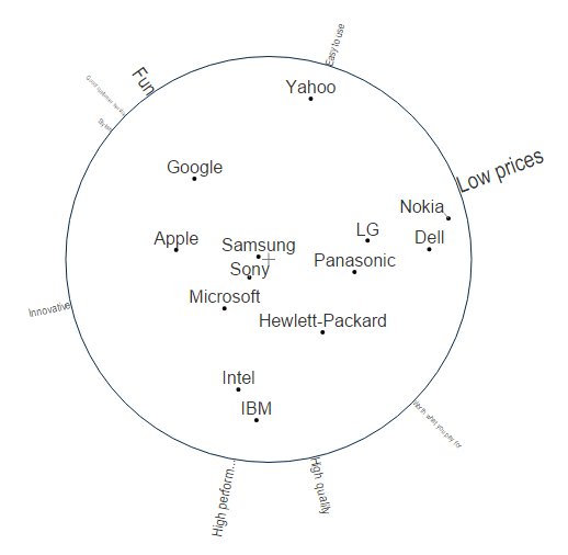
Scatterplots and Bubble Charts
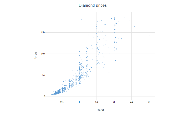
What is a Labeled Scatter Plot?
Using Scatterplots to Chart Trends in Displayr
Adding Logos to Scatter Plots in Displayr
Using Bubble Charts to Show Significant Relationships and Residuals in Correspondence Analysis
5 Ways to Visualize Relative Importance Scores from Key Driver Analysis
Labeled Scatter Plots and Bubble Charts in R
Technical Documentation: Scatterplot
Technical Documentation: Small Multiples Scatterplot
Density, Bean, and Violin Plots
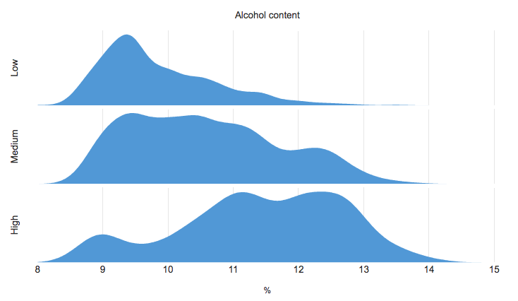
How to Make a Density Plot in Displayr
How to Create a Violin plot in Displayr
Using Heatmap Coloring on a Density Plot Using R to Visualize Distributions
Technical Documentation: Density Plot
Technical Documentation: Bean Plot
Technical Documentation: Violin Plot
Geographic Maps (Cartograms, Choropleths)
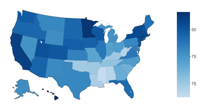
How to Make a Geographic Map in Displayr
How to Set the Initial Zoom and Position of Geographic Maps
How to Plot Data on an Interactive Globe in Displayr
Building an Interactive Globe Visualization in R
7 Alternatives to Word Clouds for Visualizing Long Lists of Data
How to Build a Geographic Dashboard with Real-Time Data
Technical Documentation: Geographic Map
Technical Documentation: Small Multiples Geographic Map
Heatmaps
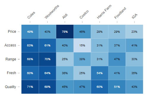
How to Create a Heatmap in Displayr
Too Hot to Handle? The Problem with Heatmaps
Making Your Data Hot: Heatmaps for the Display of Large Tables
Heatmap Shading on Tables and Charts
Using Heatmap Coloring on a Density Plot Using R to Visualize Distributions
Making Your Data Hot: Heatmaps for the Display of Large Tables
2 Rules for Coloring Heatmaps so That Nobody Gets Burnt
Technical Documentation: Heatmap
Box Plots
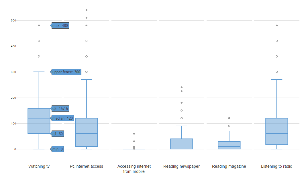
How to Create a Box Plot in Displayr
Technical Documentation: Box Plot
Venn Diagram
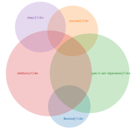
How to Make a Venn Diagram in Displayr
Technical Documentation: Venn Diagram
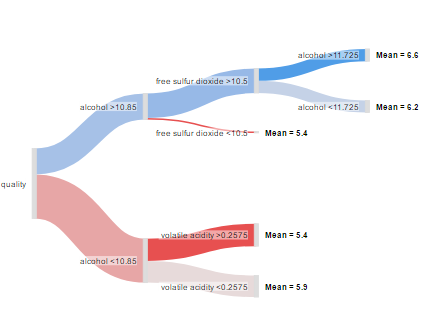
Sankey Diagram
How to Create a Sankey Diagram From a Table in Displayr
How to Create Sankey Diagrams From Tables (Data Frames) Using R
Creating Custom Sankey Diagrams Using R
Visualizing Response Patterns and Survey Flow With Sankey Diagrams
Using Colors Effectively in Sankey Diagrams
Decision Tree Visualizations using Sankey Diagrams or Charts
Technical Documentation: Sankey Diagram
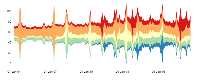
Streamgraph
How to Create a Streamgraph in Displayr
Technical Documentation: Streamgraph
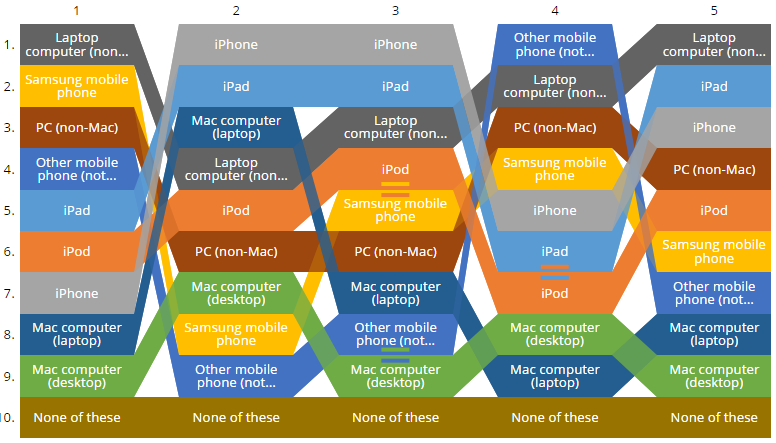
Bump Chart, or Ranking Plot
How to Create a Bump Chart (Ranking Plot) from a Table Using Displayr
Ranking Plots: Illustrating Data with Different Magnitudes
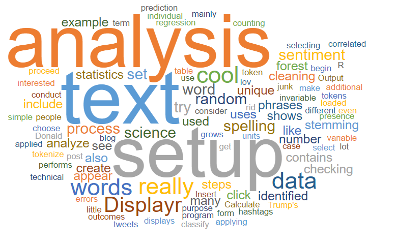
Word Clouds
How to Show Sentiment in Word Clouds using R
How to Show Sentiment in Word Clouds using Displayr
How to Show Sentiment in Word Clouds
7 Alternatives to Word Clouds for Visualizing Long Lists of Data
Using Text Analytics to Tidy a Word Cloud
The Best Tool for Creating a Word Cloud
Technical Documentation: Word Cloud
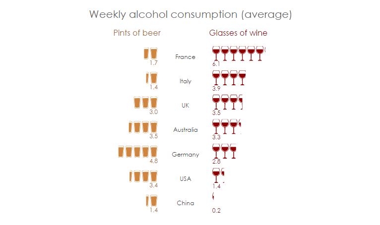
Pictographs
How to Create a Single Icon Pictograph in Displayr
How to Create a Repeated Icon Pictograph in Displayr
How to Create a Pictograph Bar Chart in Displayr
Where Pictographs Beat Bar Charts: Proportional Data
Where Pictographs Beat Bar Charts: Count Data
How to easily add custom icons in Displayr
Palm Tree Chart
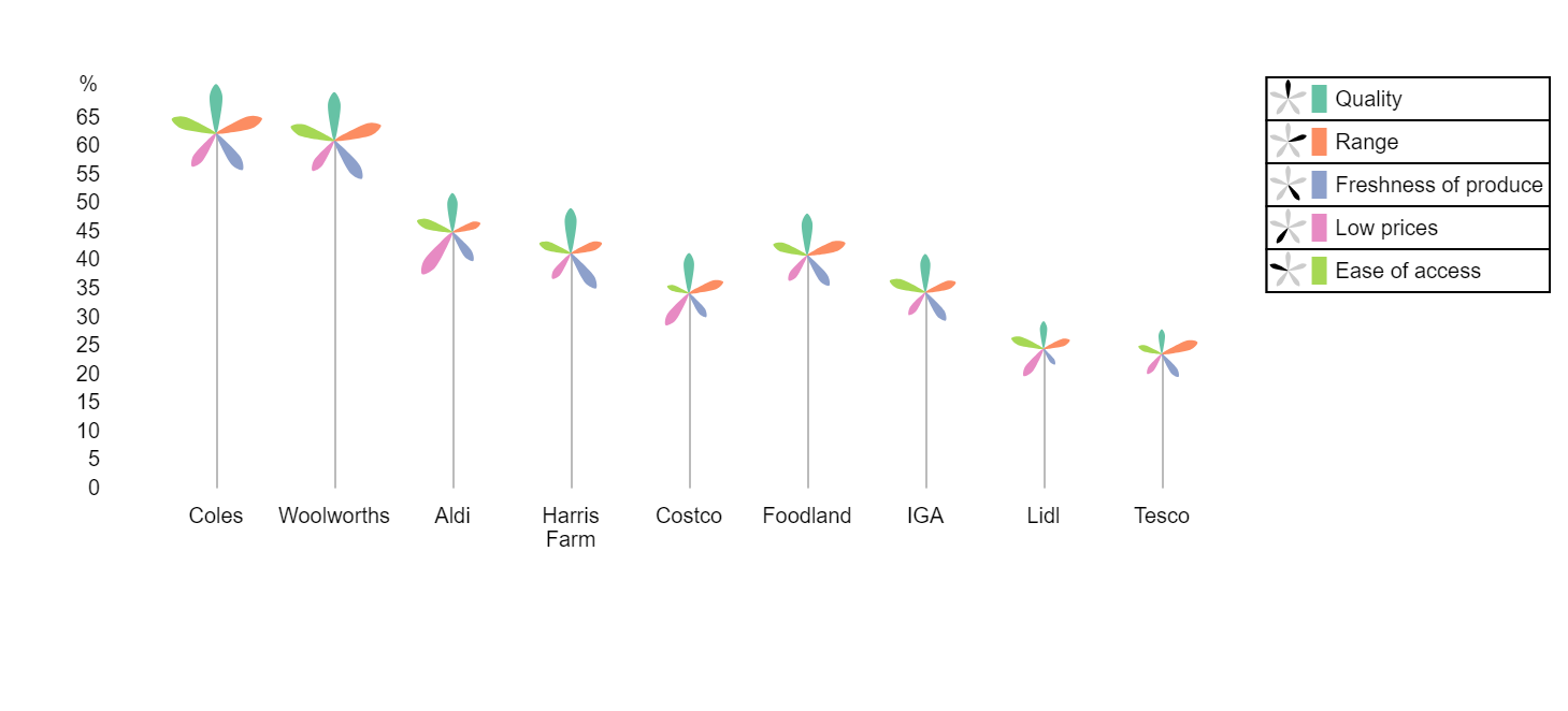
How to Create a Palm Tree Chart in Displayr
Using Palm Trees to Visualize Performance Across Multiple Dimensions (Egypt’s Scary Palm Tree)
Technical Documentation: Palm Trees
Sparklines
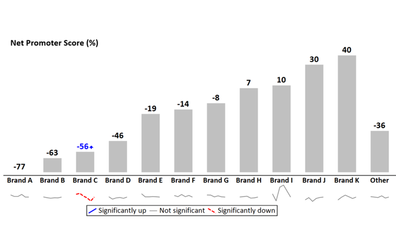
Using Sparklines to Show Trends in Bar and Column Charts
Moonplot
Moonplots: A Better Visualization for Brand Maps
Single Number Visualizations

How to Create a Single Icon Pictograph in Displayr
How to Create a Repeated Icon Pictograph in Displayr
Technical Documentation: Number
Tables
Customizing the Look and Feel of Tables in Displayr
How to Customize Tables You Can Format and Align at Will in Displayr
Make Beautiful Tables with the Formattable Package