
Filtering and Sorting Improvements for Text Categorization
"Recommendations" in the Insert menu
Displayr now offers suggestions for the most relevant next step, based on the item you've selected in your data set tree.
Undo/Redo improvements
Redo and undo multiple steps at once. You can also see easily see a history of changes to avoid removing a collaborator's work.
Use AI to write R code
It is now possible to use AI to write R code for data manipulation and analysis.
Improved Template Gallery experience
Displayr's default templates and your company's custom templates are now organized into separate tabs, making it easier to navigate and find what you need. In addition, the new template gallery also offers hands-on tutorials to help you make the most out of Displayr.
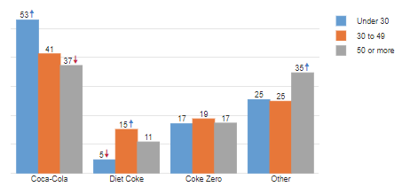
Adjustable corner roundness on bar charts and column charts
Import statistical significance and column comparisons from Excel into Displayr
Single outputs
Jump straight into data analysis without focusing on presentation just yet – quickly generate tables in Displayr without worrying about the bells and whistles.
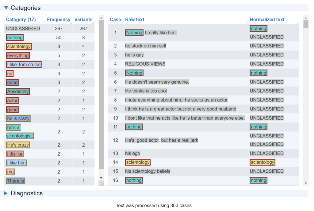
Create and modify custom classifications with Displayr's text categorization tool
Company-wide visualization templates
Save your visualization and chart styling as a template that can be applied to your document and other documents across your company.
Import CSV as tables
New Code editing experience in Displayr
The new code editing panel makes it much easier to view and edit your R code. It is also easily resizable to suit your needs.
Import Excel tables as a Data Source
Excel workbooks can now be imported as Tables (excel tables) or a Data Set (raw data)
Export to Excel with charts
Automatically export a chart alongside your tables in Excel exports.
Cell Selections and Formatting for Calculation Tables
Calculation Tables now allow you to select individual cells and customize the formatting of each cell.
Calculation Tables rendered as Variable Set Tables
Calculation Tables are now styled in the same way that tables made from Variable Sets are.
Variable Set Folders
Organize your variable sets into folders!
Add Captions to R Tables and R Visualizations
R Tables and Visualizations linked to a Displayr table can have the caption from that table piped through. Simply select the R item, Properties > Caption > Show Below
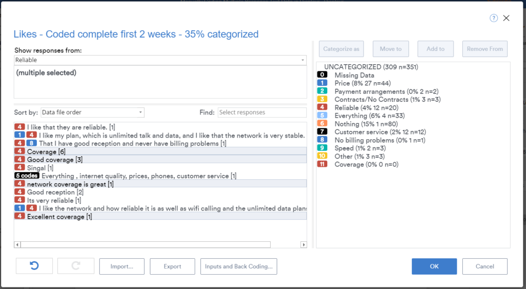
Faster Categorization of Text Data
Displayr's "Semi-Automatic" text categorization creates a draft code frame and assigns responses for you up front - you just need to fine tune the code frame and it's ready to go. Text categorization algorithms also significantly upgraded, including those for multiple response code frames and spontaneous brand awareness questions.
Faster Banner Variables
Banners are now created and calculated using internal logic language rather than JavaScript, so they work a lot faster, especially with large data files
Enhanced Caption Functionality
Captions (formerly known as 'Footers') can be hidden, shown, and custom formatted, either by individual item or default.
Enhanced automatic categorization of text data.
"Semi-Automatic" text categorization creates a draft codeframe and assigns responses - users just need to fine tune, edit. Algorithms also significantly upgraded, including for multiple response codeframes and spontaneous brand awareness questions.
Paste Embedded Objects
Embed an item (e.g. chart, table) from one Displayr document in another, 'Paste > Paste as Embedded Object'. It will then update when the originating document is updated and republished (Publish > Embed Object > Update All Embeds). Share outputs across documents without the need to duplicate the source data.
Show Significance on More Visualization Types
Significance highlights can now be added to R versions of Bar, Column, Line and Radar visualizations
Automatically Hide Non Significant Rows and Columns
Quickly simplify an otherwise complex cross-tab without the need to manually select and hide rows and columns, to help build the story in your data. See: Properties > RULES > Modify Whole Table or Plot
Advanced Significance Testing
More customization of statistical tests and how they are displayed
PowerPoint-like Text in Shapes
Rectangular shapes now have text properties, with full formatting capability. Text boxes can also be converted to Shapes with formatting properties.
Enhanced Crosstab Reports
Easily create lots of crosstabs, then automatically sort them by significance or automatically remove tables that don't satisfy significance or sample size thresholds
Integrated Chart/Visualization Selector
View all charting and visualizations in one gallery and make your selection. Easily switch tables and visualizations, or one visualization to another
Qualtrics Integration - Automatic updates
Improved functionality when importing Qualtrics data
Default and Custom Templates Gallery
Displayr now features a range of default templates to get you up and running quickly - you can edit them as required; you can even create your own "on-brand" templates and add them to the gallery
New Weighting Dialog
Displayr makes it easy to create, edit, and optimize weights for your data set, from the simple to the complex.
Custom Analyses in Menu
Enterprise customers can save items (as QScripts and RScripts) to the Displayr Cloud Drive and have them available for later use via their own company menu extension.
Data Merging
Displayr will read in (multiple) files with new cases or new variables and merge them with the current file. You can then fine tune by nominating specific items to be merged or change the level of fuzzy-matching
Sort Tables to Show Patterns
Displayr now makes it even easier to tell the story in a data table, you can automatically sort the rows, columns or both, based on patterns of significance.
Dynamic Text Box
Insert boxes that allow you to create text with number references that automatically update when the data changes.
Enhanced Calculations Menu
Automatically divide, count, average, sum from selected variables, tables, columns or rows, and much more.
Customize Rules in Displayr
You can customize Displayr's suite of Rules using the in-built editor.
Publish Data Files
You can export or publish data files (*.csv, *.sav), reflecting any edits made to the data in Displayr
Raw Data Editor
View and edit raw data Directly in Displayr - check for irregularities, clean data, publish filtered data extracts, and more
Simplification of User Interface
Substantial streamlining of menus and tool bars, powerful new functions added, better in-app learning, and faster
Data Stacking
Displayr will automatically read in variables that can be stacked and create a stacked file. Once set up the stacked file can be automatically updated when the source data changes
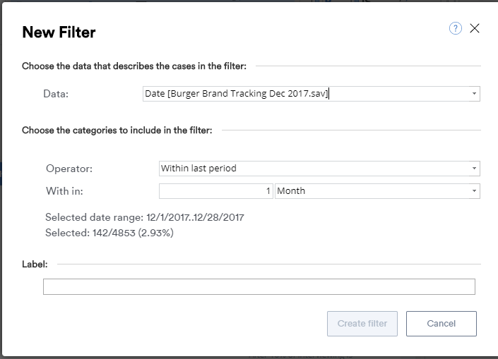
Graphical Interface for Filter Creation
A New Filter Dialog box added, [ Anything | Filtering | New ], making filter creation easier, including filters with complex conditions.
Pasting Images, Text, Data Tables using the clipboard
Copy images, text from elsewhere and paste directly into Displayr via the clipboard. You can also copy and paste tables from Excel
Read moreR-Outputs displayed as tables exportable and editable in PowerPoint
Any R-Outputs displayed as tables can now be exported to PowerPoint and edits can be made. If you later update your PowerPoint report (e.g. if the data has changed), the table will update and edits made in PowerPoint retained.
Read moreEasy Creation of Table Subsets
Extract the rows and/or columns that you want from a table to form a new one, without the need to duplicate or create new variables
Read moreRules for Displayr Tables and Charts
Displayr's version of conditional formatting. Allows customization of the content and appearance of tables and charts: conditional cell coloring, sorting, rearranging columns, and much more. Take Table and Chart automation to a whole new level
Read more*.Qdat Files
A compressed version of your data set that combines the raw variables with any additional variables created. All variables are effectively hard-coded in the new *.Qdat data set. This and the compressed format improves performance.
Read moreExport editable charts to PowerPoint
It's now possible to export editable charts to PowerPoint and automatically update them when the data changes.
Read moreUpdate existing PowerPoint presentations using Displayr
Save time and improve data accuracy by automatically updating existing PowerPoint reports with the latest set of data
Read moreList Box, Combo and Text Filters
Displayr makes it easy to create interactive filters and automatically connect them to existing outputs.
Read moreDecipher Integration
You can now import survey data from the popular survey platform, Decipher – simply select ‘Data Sets’ -> ‘+’ (or Anything -> Data -> Data Set -> Add) and enter your Decipher Base URL and API Token
Read moreAdding Stat Tests and Other Annotations to Visualizations
Stat testing symbols and letters and other annotations, such as text, circles, shading, and boxes, can now be added to visualizations
Read moreJaccard Coefficient/Index
The Jaccard Coefficient is now available as an option when conducting driver analysis
Read moreNew and Easy-to-Find Variable Transformations
Variables can now be transformed (e.g., standardized, natural logs), with the click of a button.
Read moreHost Data in a Country or Region or Your Choice
Enterprise customers can specify the country where their data is hosted
Read moreTranslate Text Variables into Different Languages
Translate any text variable into another language (e.g., mutliple input languages to English)
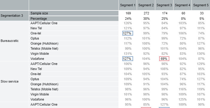
Read moreSegment Comparison Table
A new type of table for comparing difference between a segmentation, or any other categorical variable, on lots of different variables.
Read moreAutomatic Language Translation with Automatic Categorization
Set input and output languages when automatically categorizing text (e.g., automatically translate your Chinese text data into a categorization in English or German)
Read morePrincipal Component Analysis of Text Data
Automatically identify patterns in text data using PCA (factor analysis) designed for text data
Read moreAutomatic Price Sensitivity Meter
A price sensitivity meter plot is automatically generated from the raw data (Insert > More > Marketing > Price Sensitivity Meter)
Read moreAutomatic Removal of Outliers from Driver Analysis, Regression, and GLMs
A new option called 'Automated outlier removal percentage' controls the percentage of outliers automatically removed.
Audit Trail for Users
See who has accessed your documents and made changes to your account’s users in Displayr.
Read moreAutomatically Export Batched Reports to PowerPoint
Save time and effort by automatically exporting multiple, filtered reports in one go.
Learn moreSimplification of Driver Analysis
Automation of standard driver analysis setup and outputs: stacking and quad maps
Read moreDisplayr Cloud Drive
Access to a secure cloud-based storage space for storing and sharing files, making them easier and more efficient to use in Displayr – images, Microsoft chart templates, data, any files really …. even R Outputs (that you want to re-use).
Point and Click Filtering with Date Variables
When a filter is created in Displayr by clicking the New filter button, date variables can be selected and you can choose specific date ranges as well as time ranges (e.g., last 3 months)
Read moreFully-Automated Text Analysis Improvements
With the latest machine learning breakthroughs, text data can now be categorized more accurately.
See list of improvementsHyperlinks Update
Now it's easy to assign hyperlinks that link out to different pages within the document, as well as forward and back according to your browser.
Read moreImproved Text Analysis Capabilities
Semi-automated and fully-automated text analysis are now available.
See what they areAutomated Creation Of Lots Of Crosstabs
See list of upgradesRefreshed User Interface
The Displayr app gained a fresh, new look.
Copying And Pasting Between Documents Enabled
No need to build from scratch again! We have developed the ability to copy and paste items between different pages, and even across different dashboards.
Create Templates For Colors And Fonts In Visualizations
You can now create templates that make it easy to update the look and feel of multiple visualizations at once.
Read moreNew Weighting Tools: Rim Weighting And Weighting To Market Share
New Automatic Transformations
Top 2 boxes, midpoints, NPS, case-level shares, etc.
New Controls To Allow Users In View Mode To Interact With Dashboards
See listAutomatic Tools For Checking And Setting Up A Table
Identifying data checking, flat-lining, data file errors, etc.
New Visualizations
See listAdding Stat Tests and Other Annotations to Visualizations
For more info, see: Adding Significance Tests and Other Annotations to Visualizations
Jaccard Coefficient/Index
To compute the Jaccard Coefficient, click Insert > Regression > Driver Analysis, and change Output to Jaccard Correlation.
Stat testing, both against the assumption of independence and comparisons between groups is also available.
For more information see Driver Analysis in Displayr.
New and Easy-to-Find Variable Transformations
When a variable or variable set is selected, recommended transformations appear on the right of the screen. They may also be selected using Insert > Transform (Variables).
![]()
Click here for a blog post discussing how these transformations can be used in market segmentation.
Host Data in a Country or Region or Your Choice
See the post Host Data in a Country of Your Choice
Translate Text Variables into Different Languages
See the post Automatic Language Translation of Text Variables
Segment Comparison Table
Insert > Group/Segment > Segment Comparison Table. You can read more about it here: https://www.displayr.com/tools-for-evaluating-segmentations/
Automatic Language Translation with Automatic Categorization
See the post Automatic Language Translation with Automatic Categorization
Principal Component Analysis of Text Data
This is available in Insert > Text Analysis > Advanced.
See the post Principal component analysis of text data
Automatic Price Sensitivity Meter
See the post What is the price sensitivity meter?
Automatic Removal of Outliers from Driver Analysis, Regression, and GLMs
See the post Automatic Removal of Outliers from Regression and GLMs
Audit Trail for Users
See the post How to Audit Access to your Displayr Documents and Users
Shapley Regression
Automatically Export Batched Reports to PowerPoint
See the post How to Automatically Export Multiple Reports with Different Filters
Simplification of Driver Analysis
Displayr Cloud Drive
Access to a secure cloud-based storage space for storing and sharing files, making them easier and more efficient to use in Displayr – images, Microsoft chart templates, data, any files really …. even R Outputs (that you want to re-use).
Read morePoint and Click Filtering with Date Variables
When you select a table, chart, or other output and click FILTERS & WEIGHTS > NEW and select a date variable for Data you can now choose to create a dynamic filter (e.g., filtering for the last 3 months, which will update when the data changes) or filter for specific ranges.
Fully-Automated Text Analysis Improvements
- Automatically classify new data to an existing code frame (single response and multiple response)
- Entity extraction
- N-grams (Phrase detection)
Hyperlinks Update
Now it’s easy to assign hyperlinks that link out to different pages within the document, as well as forward and back according to your browser.
Find out moreImproved Text Analysis Capabilities
Semi-automated:
Fully-automated:
Watch webinarAutomated Creation Of Lots Of Crosstabs
- Automatic restructuring of data for crosstabs (e.g., flattening of grids)
- Automatic sorting of tables
- Automatic deletion of uninteresting tables
Create Templates For Colors And Fonts In Visualizations
When it comes to brand, consistency is king. You can now create templates that make it easy to update the look and feel of multiple visualizations at once, from the color series being used, to the size of the data labels.
New Controls To Allow Users In View Mode To Interact With Dashboards
- Text boxes
- List boxes
- Date controls
TURF Analysis,
- Incrementality plot
- Upset plot
Conjoint Improvement
- Automatic creation of conjoint simulators
- Multinomial logit
- More options for HB
- Dual response none
New Visualizations
- Sparklines
- Conditional images
- Missing data plot by cases